2005–2023

Portfolio archive

Client work from 2005 onwards, most of it built in Guernsey. Plenty of these sites are long gone; the ones still standing are linked. Recent work is on its way.

44 projects

2023

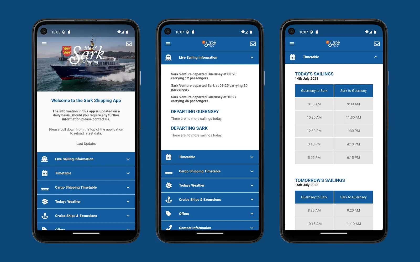
  • Three Android phones side by side: the home screen with the Isle of Sark Shipping wordmark over a photograph of the Corsaire de Sercq and a list of collapsed rows, the live sailing information panel, and today and tomorrow sailings as two-column timetables

    Sark Shipping App

    Isle of Sark Shipping CompanyDesign and development

    Sark has no cars and no airport, so the only question that matters in winter is whether the boats are running. An iOS and Android app answering it on one screen, built in Flutter in 2020, rewritten on Flutter 3 in 2023, and retired by the company in 2026.

    • flutter
    • dart
    • firebase
    • react

    Visit site

2017

  • The Larvotto wordmark: an interlocking double-L emblem above the name LARVOTTO in a modern serif

    Larvotto Swimwear Website

    LarvottoProduct image zoom and category landing pages

    A Magento storefront for a French luxury swimwear brand. My part of the build was the product-page image zoom and the category landing pages used for its seasonal campaigns.

    • magento
    • php
    • jquery

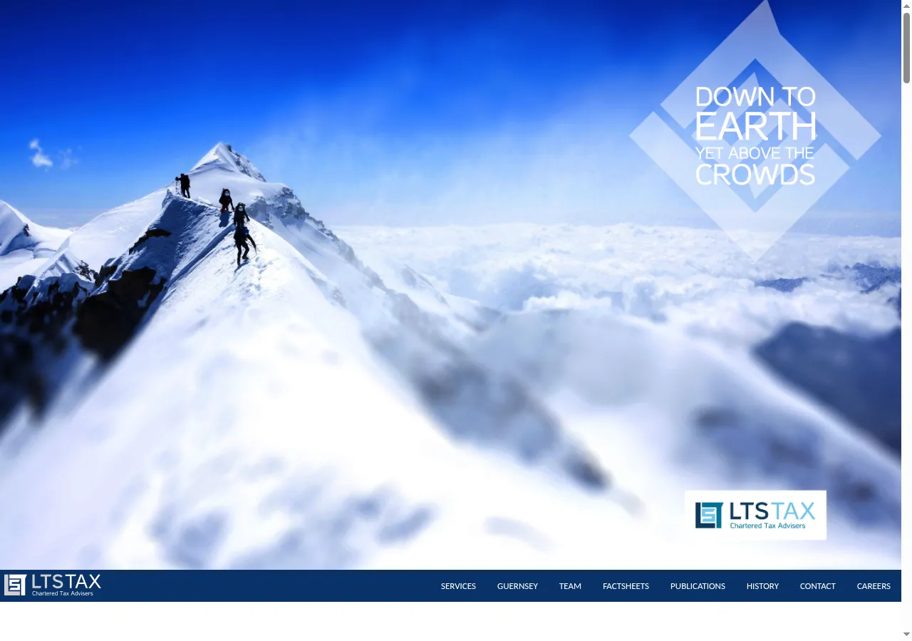
  • LTS Tax's homepage: a mountain ridge above the clouds under the line "Down to earth, yet above the crowds", with the LTS Tax chartered tax advisers logo

    Legis Group Websites

    Legis GroupDesign and development

    Three Guernsey fiduciary and tax brands under one group — Legis, LTS Tax and Albion Family Business — rebuilt as a family of sites sharing one visual language: full-bleed mountain photography, a hawk in flight, and the same Foundation-based front end underneath.

    • foundation css
    • sass
    • grunt
    • bower

2015

  • kelvinregg

    Kelvin Re – Holding page

    Kelvin Re

    This is just a simpe one-pager for reinsurance company Kelvin Re but with some nice responsive features and CSS animation when the page loads to give an otherwise fairly unexciting…

    • holding page

2014

  • Homepage - New Street Management

    New Street Management Website

    New Street Management

    This is a nice clean and simple one-page design for a Guernsey Trust company, using the Foundation CSS framework and graphical elements from TwoDegreesNorth. The project well well…

    • corporate
    • foundation css
    • mapbox
    • responsive

    No longer online

2013

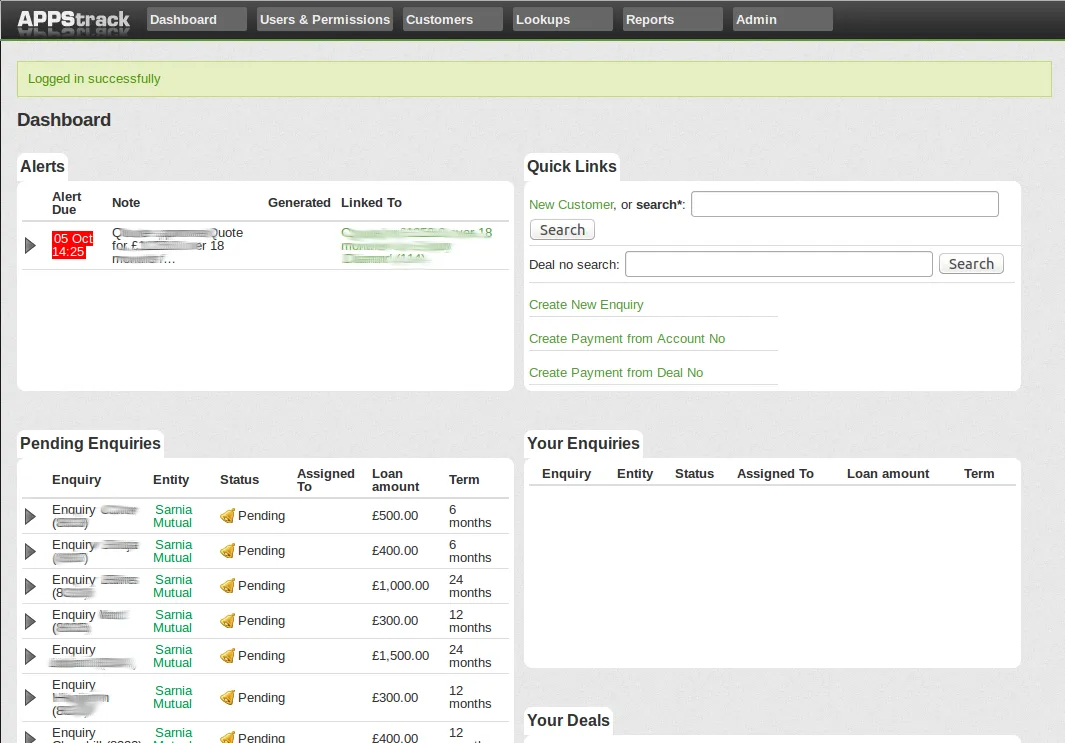
  • The Appstrack dashboard: alerts due, quick links to search and create records, and tables of pending enquiries, deals and your own open work

    Appstrack — Loan Management System

    The Loan ShopDesign and development

    An internal Rails app for a Guernsey consumer credit lender: it took an enquiry in from the website, carried it through underwriting to a signed deal, and then tracked the loan — payments, arrears and credit reporting — for the rest of its life.

    • ruby on rails
    • mysql
    • sqlite

2011

  • mainmenu

    Catherine Best Magento eCommerce Website

    Catherine Best

    This Magento site had a really fast turn-around and I think everyone has been really pleased by the results. We are aiming for a high-end market and trying to make the most of the…

    • ecommerce
    • guernsey
    • magento development

  • homepage

    Loc8tor Multi-Region Multi-Language Magento eCommerce Website

    Loc8tor Multi-Region Multi-Language

    This new site follows a design I was provided and is built using Magento and a number of specialist plugins. The core Magento functionality for different websites and stores was…

    • magento development

  • magento-anythingsurf-index_bigger

    Magento shop launched – AnythingSurf.co.uk

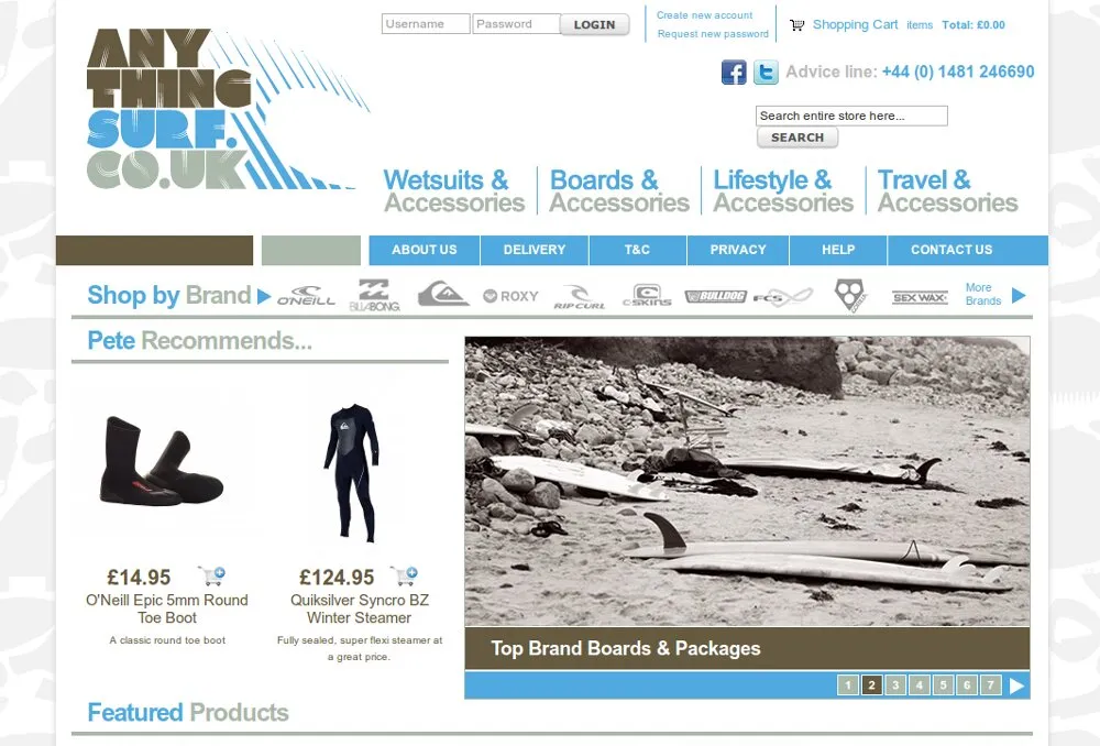
    It’s been a while since this actually went live – but at last I can show off a few of the pages from the latest Magento eCommerce site I have built – AnythingSurf.co.uk.

    • ecommerce
    • javascript
    • magento
    • magento development

  • 5 star payday loans WordPress site

    Five Star Payday Loans WordPress Site

    Five Star Payday Loans

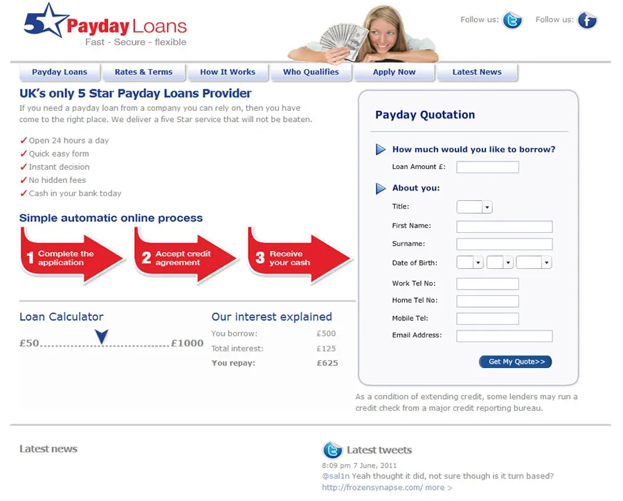
    This was a simple site based on a HTML home page, with a javascript calculator and a wordpress blog simply attached with the same design. The application form is a third-party…

    • wordpress

2010

  • barras-car-centre-homepage

    Barras Car Centre Website

    Barras Car Centre

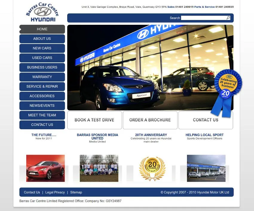
    The Barras Car Centre website required that they could upload details of new and used cars and display them, as well as provide a feed of the information for other third party…

    • cars
    • guernsey
    • web development

    No longer online

  • eacarey-homepage

    Carey’s Pipe & Tobacco Shop Magento/WordPress eCommerce Website

    Carey’s Pipe & Tobacco Shop Magento/WordPress

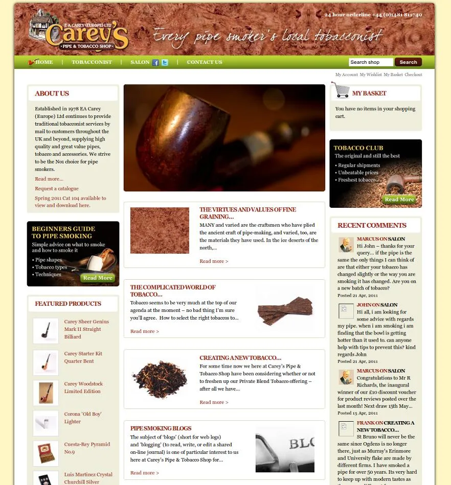
    For this website the real key was enabling customers to engage via social media and to create a place where pipe smokers could discuss their hobby. Due in part to the way in which…

    • ecommerce
    • facebook
    • magento development
    • social media
    • wordpress

    No longer online

  • fairmoves-homepage

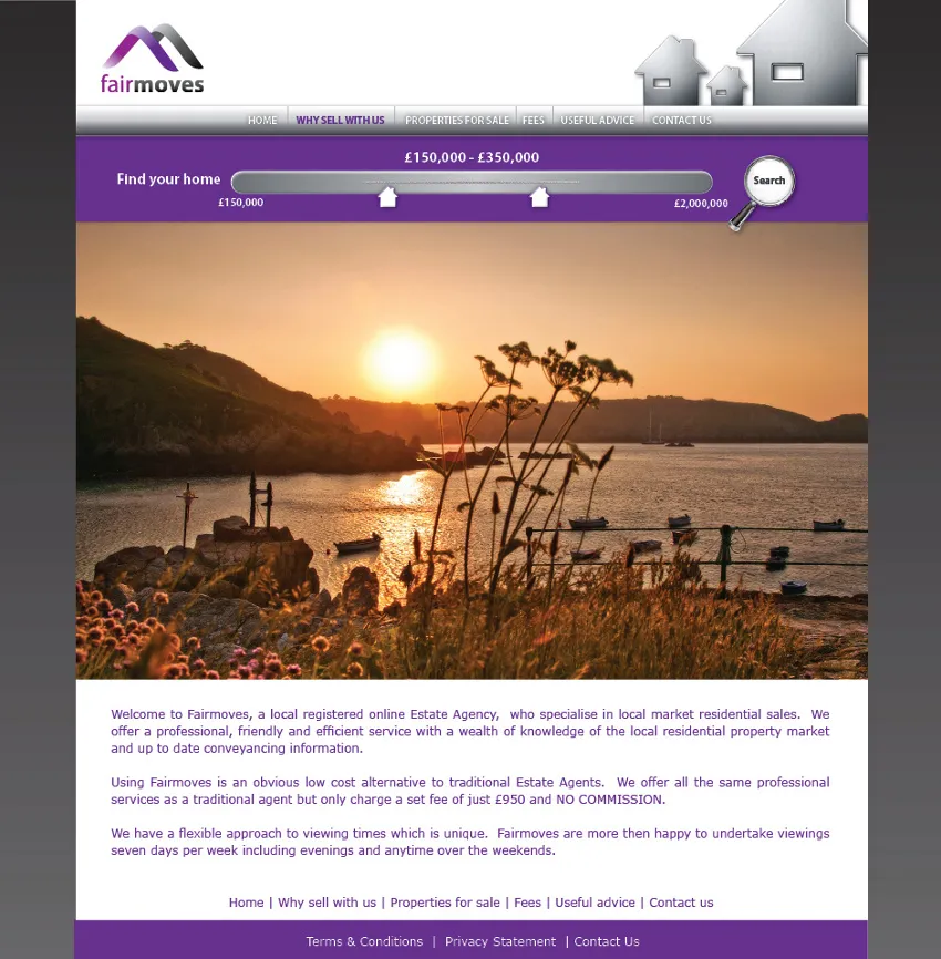
    Fairmoves – Guernsey Estate Agent Website

    Fairmoves – Guernsey Estate Agent

    Fairmoves was a website for a startup estate agent in Guernsey, the project gave me the chance to write a Ruby on Rails application and involved a really slick integrated design.

    • estate agent
    • guernsey
    • ruby on rails development
    • scriptaculous

  • Mobile Website Search for Guernsey Phonebook

    Find.gg Mobile Website

    Find.gg

    After having implemented the Cable & Wireless Guernsey telephone directory into the find website it seemed a really good idea to try to make this work for people’s mobile phones.…

    • guernsey
    • mobile
    • telephone

  • think-design-homepage

    think Freelance Design Website

    think Freelance Design

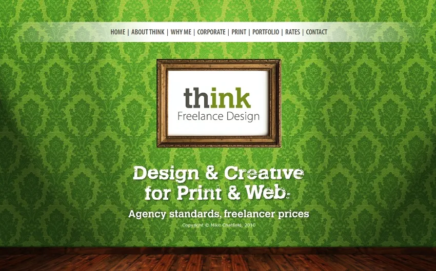
    This was a really quick HTML website that needed some integration with third-party systems to allow the site owner (a freelance designer I work with occasionally) to be able to…

    • cms
    • cushy
    • cushycms
    • emailmeform
    • emf
    • web development
    • website development

  • Guernsey Telephone Directory

    Guernsey Telephone Directory for Find.gg

    A brief meeting with Cable & Wireless Guernsey and we hit upon the idea of integrating a portion of the find website with their island wide telephone directory. The main complaint…

    • directory
    • find
    • guernsey
    • phonebook
    • telephone

  • petit_bistro_splash

    Le Petit Bistro Website

    Le Petit Bistro

    This project was to provide a simple to use wordpress site that conveyed the ambiance of Le Petit Bistro Guernsey to both customers and potential staff. The site was put together…

    • wordpress

    No longer online

  • payday_loans

    Loans Aggregator for Guernsey

    For this project we added the Prototype and Scriptaculous javascript libraries to find.gg in order to provide some sliders and AJAX functionality for a loans aggregator for the…

    • ajax
    • guernsey
    • javascript
    • prototype
    • scriptaculous

  • possible alienempires logos

    Logo Designs for AlienEmpires

    The game may have been around for a whille as lcog but now we have a new name – AlienEmpires, we really needed a new logo.

    • alienempires
    • branding
    • design
    • logos
    • my games
    • pbem
    • planets
    • strategy
    • turn based

  • martel-maides-homepage

    Martel Maides Guernsey Estate Agent Website

    Martel Maides Guernsey Estate Agent

    Building Martel Maides a new website was a fairly large undertaking and involved a website build, plenty of custom functionality as well as a complex integration project with their…

    • estate agent
    • integration
    • rails
    • ruby
    • ruby on rails development
    • website development

    No longer online

  • nerdexpress-business-card-front

    Nerdexpress Business Cards

    Nerdexpress

    As a follow on from building the Nerdexpress website I was also asked to produce business cards. I think they turned out quite well, although it is a shame that working remotely I…

    • design
    • print

  • Nerdexpress Twitter Background

    Nerdexpress Twitter Background

    Nerdexpress

    As the Nerdexpress company started to work more and more with twitter, Facebook and other social media they felt they should try to push their brand out onto these platforms as…

    • background
    • design
    • twitter

  • nerdexpress-homepage

    Nerdexpress WordPress Website

    Nerdexpress

    For this job I inherited some branding and an initial homepage design but once I started talking with the client it became clear that the design was somewhat lacking for his needs.…

    • design
    • website development
    • wordpress

  • quantummedmarine

    Quantum Med Marine Website

    Quantum Med Marine

    This website build was a WordPress site built to a design put together by our in-house designer and included JavaScript fading images and pop-up windows for video, for which we…

    • javascript
    • php
    • video
    • wordpress

    No longer online

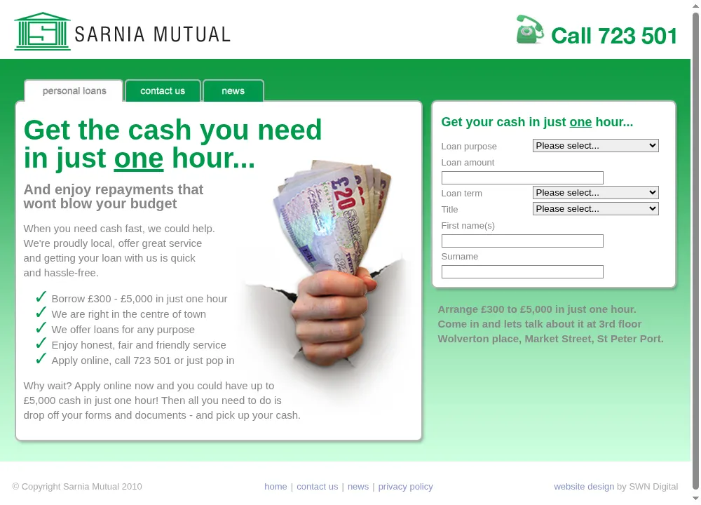
  • The Sarnia Mutual homepage: "Get the cash you need in just one hour", a list of reasons to apply, a photo of a hand holding banknotes, and a loan application form down the right-hand side

    Sarnia Mutual / The Loan Shop Website

    Sarnia Mutual (later The Loan Shop)Design and development

    The public side of a Guernsey short-term lender: a PHP and Smarty site built to get someone from "I need cash today" to a submitted application in one visit, feeding straight into Appstrack on the other end.

    • php
    • smarty
    • javascript

  • zcardmatrix

    Z-Trade Direct Pricing Matrix Component

    For this small project I built a mysql database and PHP and AJAX front-end that enabled clients to get quotes directly from the website. The AJAX allowed you to select various…

    • ajax
    • iframe
    • mysql
    • php

    No longer online

2009

  • Find "Splash" Menu

    Find.gg A Comparison Website for Guernsey

    Find was a joint venture between myself and two collegues that intends to satisfy a niche in the Guernsey market. Many websites exist throughout the UK that offer used cars, estate…

    • find
    • guernsey
    • rails
    • ruby
    • ruby on rails development

  • property_map

    Google maps Mashup for Property in Guernsey

    This project was undertaken to add a new dimension to searching for and finding property in Guernsey. Sellers or estate agents are now able to position a marker on a google map to…

    • api
    • google
    • javascript
    • map
    • mashup
    • property

  • independent-risk-reporting-homepage

    Independent Risk Reporting Website

    Independent Risk Reporting

    Independent Risk Reporting was a two-part project, firstly to create a simple informational homepage and contact for the client and secondly to create a risk reporting…

    • html
    • rss
    • smarty
    • website development

  • investment-questionnaires-requested

    iQ Investment Questionnare Risk Reporting System

    This project was to build an online system with various user roles for requesting, completing and reviewing risk reporting questionnaires. Ruby on Rails seemed the best framework…

    • ajax
    • rails
    • ruby
    • ruby on rails development
    • system

  • zcard

    Z-Card Mobile Website

    Z-Card

    I recently built a version of the Z-Card website designed for people arriving to the site on a mobile phone or other small screen interface. The basic look and feel was handed over…

    • mobile
    • php
    • smarty

    No longer online

2008

  • Debtbuster Loans Optimized PPC Landing Page

    Debtbuster Loans Optimized PPC Landing Page

    This design hopes to split the sales messages off onto a front page and then concentrate more on support and reassurance messages on subsequent pages. This design went live in Feb…

    • asp.net
    • central trust
    • design
    • landing pages
    • my portfolio
    • optimization
    • ppc
    • web

  • Debtbuster Loans Optimized Single Page PPC App

    Debtbuster Loans Optimized Single Page PPC App

    This application was the technically most advanced that I built for Central Trust and involved AJAX validation and postcode lookups as well as front-end only Javascript for…

    • ajax
    • asp.net
    • central trust
    • design
    • landing pages
    • my portfolio
    • optimization
    • web

  • more_briefus_logo_ideas

    Development of a logo for briefus.com

    It is times like this which I had an expert typographer at hand.

    • branding
    • design
    • logos
    • web

    No longer online

  • Savings Calculator – Landing Page Optimization

    Savings Calculator – Landing Page Optimization

    Here I descibe in detail my approach to taking a working control landing page and turning it into something all together more effective. My landing page optimization process, fully…

    • central trust
    • design
    • landing pages
    • my portfolio
    • optimization
    • ppc
    • web

2007

  • BriefUs Briefing System

    BriefUs Briefing System

    As the companies creative team (web and traditional) grew, we required a system for managing our briefing system. I designed and wrote briefus to meet this need. All members of our…

    • design
    • my portfolio
    • ruby
    • ruby on rails development
    • web
    • website development

    No longer online

  • Central Capital Mortgages

    Central Capital Mortgages

    The Central Capital Mortgages site has been running for a number of years with limited profitability. My redesign has made huge improvements and at present other marketing…

    • asp.net
    • central trust
    • design
    • landing pages
    • my portfolio
    • optimization
    • ppc
    • web
    • website development

  • Debtbuster Loans AJAX PPC Landing Page

    Debtbuster Loans AJAX PPC Landing Page

    In Sept 2007 I designed a new landing page and added a number of enhancements to the application form. Primarily these were client-side enhancements based on usability. The design…

    • ajax
    • asp.net
    • central trust
    • design
    • javascript
    • landing pages
    • my portfolio
    • ppc
    • prototype
    • web

  • Debtbuster Loans Website

    Debtbuster Loans Website

    Debtbuster Loans

    Until this release very little effort had been made to increase the sites visibility in natural search engines. This version of the site was used on all none landing pages and was…

    • asp.net
    • central trust
    • design
    • my portfolio
    • seo
    • web

    No longer online

2006

  • central-capital-commercial-homepage

    Central Capital Commercial Website

    Central Capital Commercial

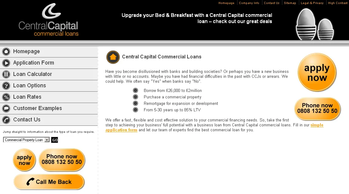
    This was a relatively new brand for the company and had been untested on the web. This was entirely my project from a creative perspective and I managed the relationship with the…

    • asp.net
    • branding
    • central trust
    • design
    • my portfolio
    • web
    • website development

  • Central Capital Website

    Central Capital Website

    Central Capital

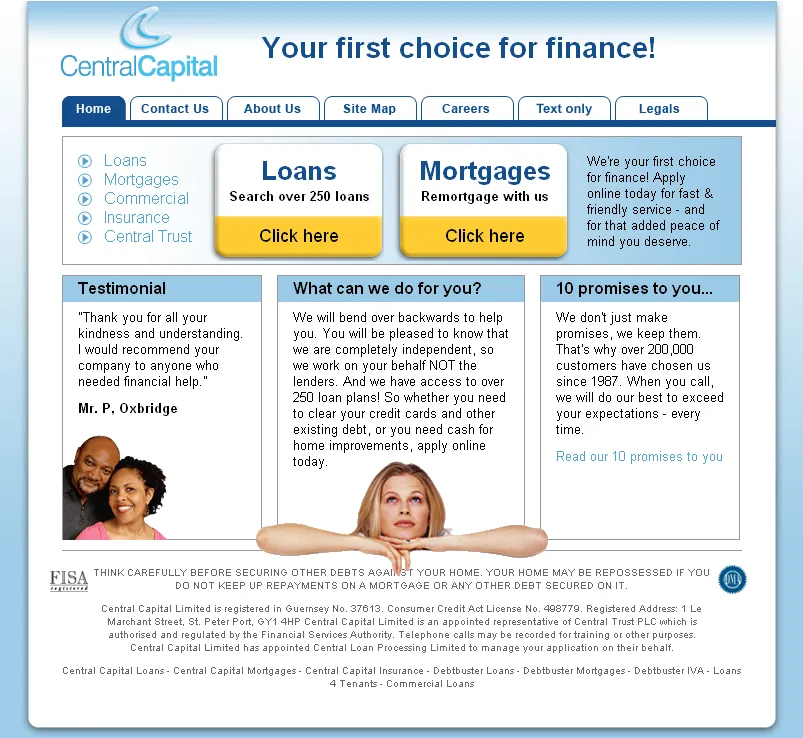
    This is the Central Capital loans and mortgages site, mainly used for marketing to customers. It links through to the centralcapitalloans.com and centralcapitalmortgages.com sites.…

    • asp.net
    • central trust
    • design
    • my portfolio
    • web
    • website development

  • Loans4Tenants Website

    Loans4Tenants Website

    Loans4Tenants

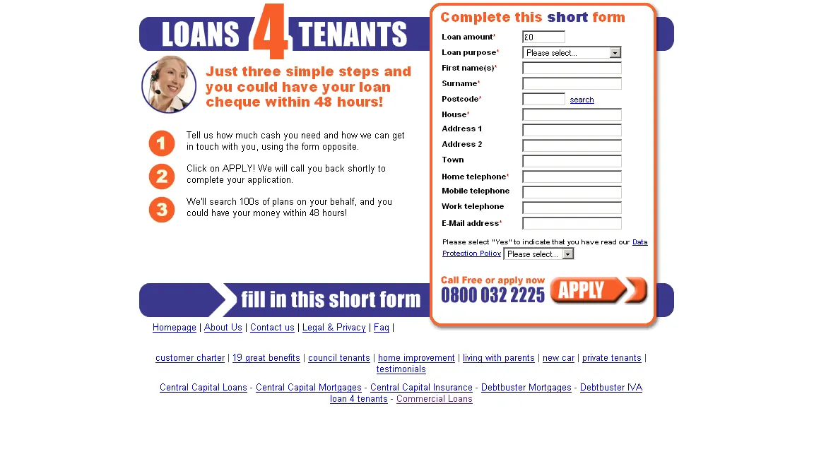
    I designed the loans4tenants site and created the logo, although there was a colour scheme change before we went live. I build the site myself, including the application form,…

    • asp.net
    • central trust
    • design
    • my portfolio
    • web
    • website development

    No longer online

  • Platinum Loans Website

    Platinum Loans Website

    Platinum Loans

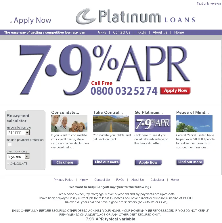
    Platinum Loans was a new brand created in order to offer an individually chosen loan plan with a low rate so that we could advertise a low APR. Compliance required that we check…

    • asp.net
    • central trust
    • my portfolio
    • web
    • website development

2005

  • Guernsey Electricity Website

    Guernsey Electricity Website

    Guernsey Electricity

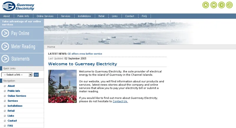
    The Guernsey Electricity site combines a professional corporate look with a highly accessible structure. I have tried to emphasise the most used areas of the site (primarily the…

    • asp
    • design
    • guernsey
    • guernsey electricity
    • my portfolio
    • web
    • website development

2023Isle of Sark Shipping CompanyDesign and development

Sark Shipping App

The Isle of Sark Shipping Company’s boats are the island’s link to Guernsey, and before this app the question of whether today’s sailings were running was answered by phoning the harbour office. I built the first version in February 2020, largely as an excuse to learn Flutter, and it shipped on Google Play and the App Store shortly after.

The app is only a third of it. Behind it sits a Firebase realtime database and a small React CMS, and the CMS is what made it work: the harbour office types in the day’s sailings, cargo runs, cruise ship arrivals and any disruption, and the app is only ever reading that back. No scraping and no inference about what the boats are probably doing — someone who knows says what is happening, and everyone else sees it. A Node script pruned old days off the database so years of past sailings weren’t shipped to every phone on every load.

On screen it is one list of collapsed rows: live sailing information, today and tomorrow’s timetable, cargo, weather, cruise ships, offers and contacts. An alert dialog on launch reports disruption, and reports the good day too — green for sailings running as scheduled, because silence reads as no information. Every fetch is written to a file and a failed fetch falls back to it, since Sark has patchy signal and the moment you want the answer is usually standing on a quay.

It was maintained through Flutter’s major versions and rewritten as version 2 on Flutter 3 in 2023, which is when the welcome copy became content-managed rather than baked in. Sark Shipping decommissioned the app in 2026 and moved live sailing information to a page on their website.

The home screen: the Isle of Sark Shipping wordmark over a photograph of the Corsaire de Sercq under way, a welcome message, and a list of collapsed rows for live sailing information, timetable, cargo, weather, cruise ships and offers

Live sailing information: three service messages recording which vessel left which island at what time and with how many passengers, then the next departures from Guernsey and Sark

Today’s and tomorrow’s sailings, each as a two-column table of times headed Guernsey to Sark and Sark to Guernsey

The contact screen: addresses, emails and phone numbers for the Guernsey and Sark offices, opening hours split between cargo and reservations, and a link for booking online

Visit site

2017LarvottoProduct image zoom and category landing pages

Larvotto Swimwear Website

The Larvotto wordmark: an interlocking double-L emblem above the name LARVOTTO in a modern serif

Larvotto — named for the beach along Monaco’s coast — sold swimwear on a Magento RWD storefront with a custom skin: the brand’s own emblem and wordmark, a bespoke colour and type treatment, and a rotating set of campaign banners on the homepage. Shipping ran through several French carriers — Chronopost, So Colissimo, Geodis, DPD — and payment through Adyen, both configured for a business posting from France to customers well beyond it.

My own contribution was narrower than the whole build: wiring up ElevateZoom on the product pages so a shopper could hover a thumbnail and inspect the fabric and stitching close up, and building the category landing pages the campaigns pointed at — the promotional blocks above and below a category’s product grid that turned a plain listing into a seasonal launch page.

2017–2018Legis GroupDesign and development

Legis Group Websites

Legis Group runs several regulated Guernsey businesses under one roof — trust and corporate services, tax advice, family business services — each historically with its own site, its own look and no obvious link between them. This rebuilt three of those brands on the same scaffold: Legis itself (LTS Tax Limited, its chartered tax arm), New Street Management and Albion Family Business, sharing one Foundation-based build, one component library and one visual idea — a bird of prey against big Guernsey sky — carried across all three with each brand’s own colour and copy.

New Street Management already had a site here from 2014; this was the group-wide rebuild three years later, done at the same time as the two sister brands rather than as a one-off refresh. Sharing a component library shows up further down each page too: all three run the same “why Guernsey” section — the same paragraph of copy about the island’s reputation as a jurisdiction, the same harbour photograph — just recoloured to match the brand around it.

Albion Family Business’s homepage: a kestrel in flight against a cloudy sky over the Albion Family Business logo

Further down Albion Family Business’s page: the services list, then the Guernsey section with its harbour photograph, then the start of the team grid

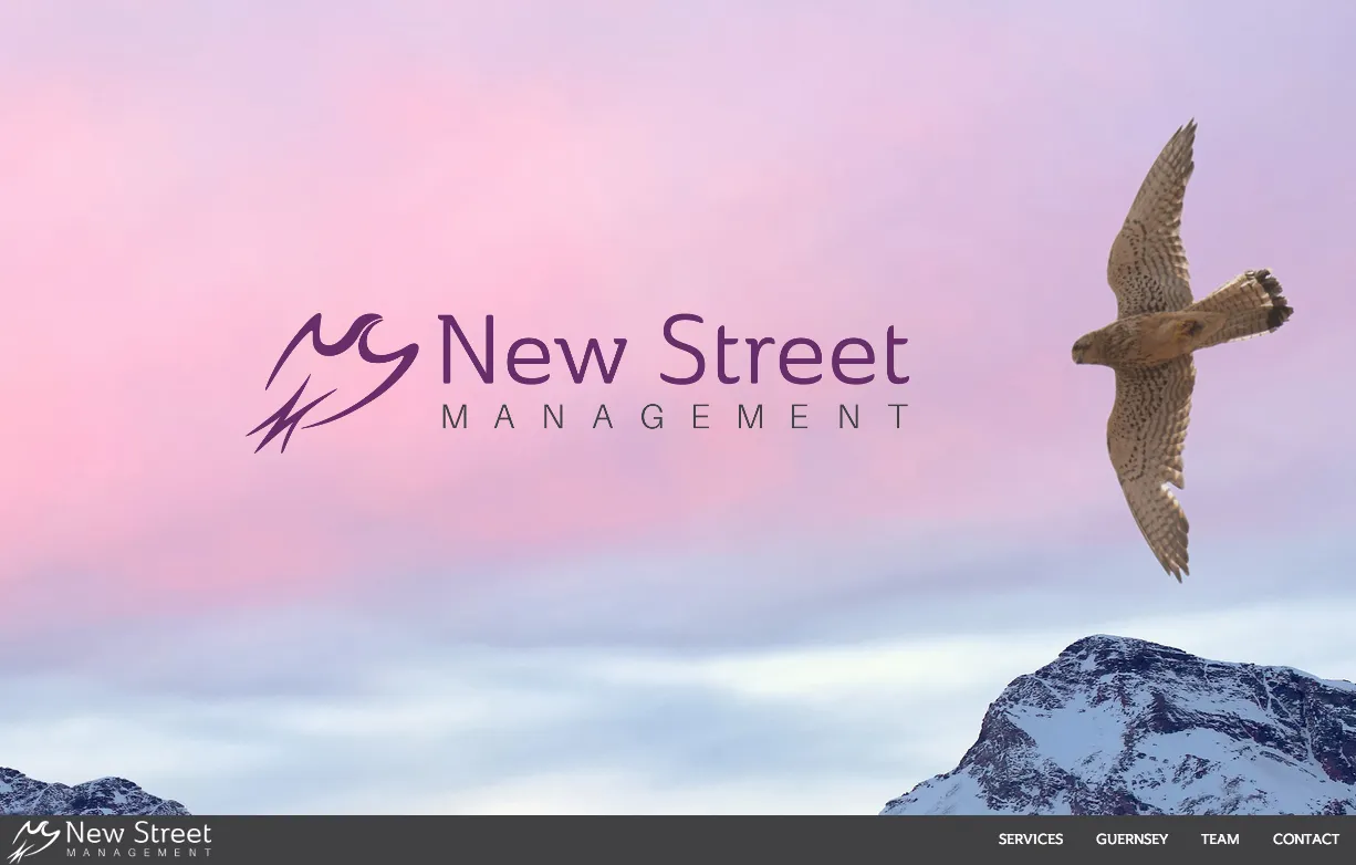
New Street Management’s homepage: a hawk against a dusk sky over the New Street Management logo, with award badges from Citywealth, IFC Powerwomen and STEP

Further down New Street Management’s page: the same services and Guernsey layout as Albion’s, in the brand’s own purple

Further down LTS Tax’s page: the factsheets library, two columns of downloadable PDFs on trust tax, domicile, ATED and UK residence

2015Kelvin Re

Kelvin Re – Holding page

kelvinregg

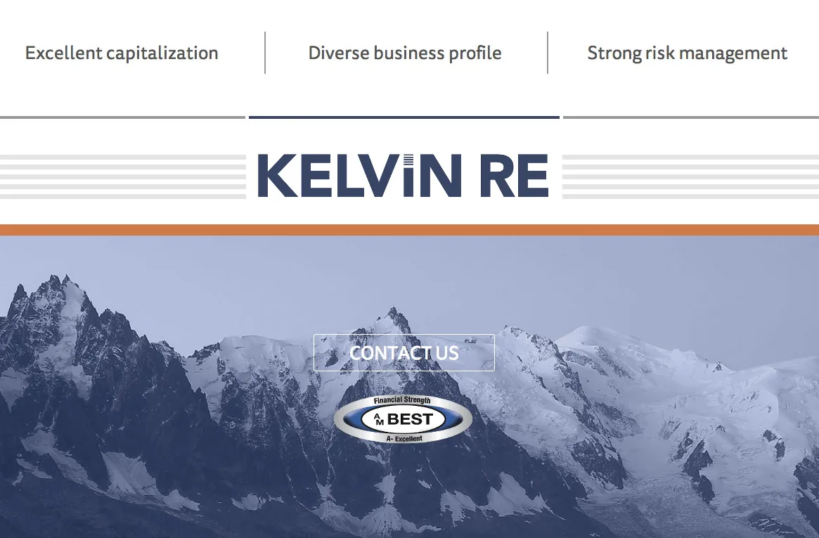
This is just a simpe one-pager for reinsurance company Kelvin Re but with some nice responsive features and CSS animation when the page loads to give an otherwise fairly unexciting page a bit of life. Awaiting designs for the full website, so watch the space for something a little more interesting.

2014New Street Management

New Street Management Website

This is a nice clean and simple one-page design for a Guernsey Trust company [Link nolonger availible], using the Foundation CSS framework and graphical elements from TwoDegreesNorth. The project well well and was turned around quickly for the client.

Services - New Street Management Ltd

Contact - New Street Management

2013–2016The Loan ShopDesign and development

Appstrack — Loan Management System

The Loan Shop needed something to replace a spreadsheet: enquiries were coming in from their website faster than anyone could copy them into one by hand, and once a loan was live there was nowhere to keep track of it beyond the original agreement. Appstrack was built to close that whole loop in one place — a Rails 3 app that imported enquiries by a scheduled task, walked staff through turning one into a customer and a deal, and then owned the loan for as long as it existed.

The later of that is most of what kept it in service for three years. A monthly rake task pulled payments in from the company’s banking export and matched them against each loan’s expected schedule, catching anything that hadn’t arrived, and drove the balance sheet and interest income figures that came out the other end. A second task built the CAIS submission — the file consumer lenders send to the credit reference agencies each month — from the same records, so the numbers reported to Experian and Equifax and the ones on the loan’s own history could never quietly drift apart.

None of that was glamorous, and Appstrack looked plain by design: a dashboard, a customer record, a quote, a deal. The interesting part was underneath, making sure a business that lives or dies on accurate arrears figures never had to trust a spreadsheet again.

A customer record: personal and contact details on the left, and a possible-duplicate check against existing customers on the right

A deal record: loan amount, term and rate, its status and the applicant’s details, next to its payment schedule

A quote for a loan, showing the proposed repayment structure and the full monthly payment schedule beside it

2011Catherine Best

Catherine Best Magento eCommerce Website

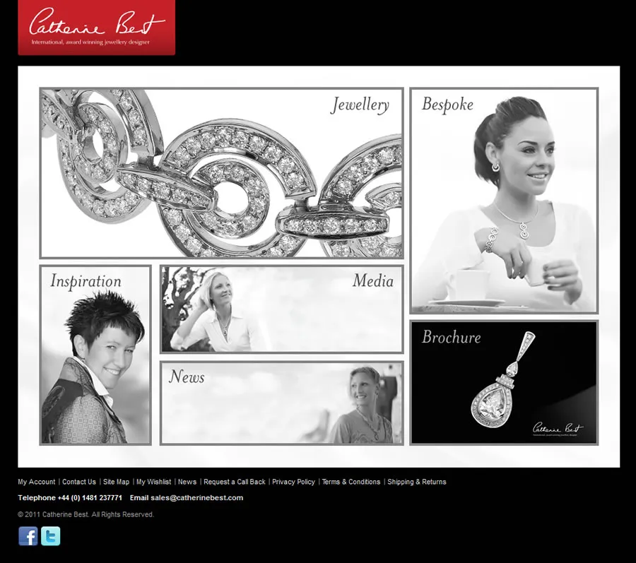
This Magento site had a really fast turn-around and I think everyone has been really pleased by the results. We are aiming for a high-end market and trying to make the most of the Jewellery. From a technical point of view the site uses Magento under the hood, but the product lists have been heavily customised to show large product images and use some flashy javascript to scroll through the product photos. The product pages themselves have also been customised significantly to provide a much simpler and cleaner view than a standard Magento page would provide but also to replace the standard photo zoom function with a nicer looking thumbnail/image arrangement. Once you start getting deeper into the eCommerce bits of the site it reverts to a slightly more Magento standard look and feel – because it works so well.

Take a look at the gallery below for a closer look.

mainmenu

pendants

earrings

product-page

shopping-basket

checkout

contact-form

blog

2011Loc8tor Multi-Region Multi-Language

Loc8tor Multi-Region Multi-Language Magento eCommerce Website

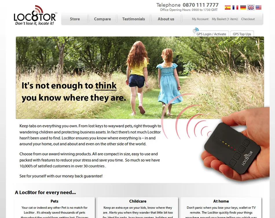
This new site follows a design I was provided and is built using Magento and a number of specialist plugins. The core Magento functionality for different websites and stores was used to create versions of the site in multiple languages and with slightly different product ranges and pricing. All of this was done with the minimum of repetition within the admin portion of the site.

I used an Advanced Currency plugin by Retail Evolved to allow for prices to be set in one currency but billed in another – allowing the site owners to keep a single currency merchant account. The checkout then uses a OneStepCheckout plugin to provide a much slicker purchasing process.

The site also integrates with a third-party site for tracking the customers purchased GPS devices. This involved sending top-up purchases to a SOAP webservice and the creation of a device activation and login section to send customers through to the tracking panel.

homepage

store

product

basket

checkout

topup_products

tracking_login

tracking_activate

tracking_panel

2011

Magento shop launched – AnythingSurf.co.uk

It’s been a while since this actually went live – but at last I can show off a few of the pages from the latest Magento eCommerce site I have built – AnythingSurf.co.uk.

This is actually a fairly standard Magento shop with some back-end integration that we already had in place for the client. The front-end design was provided by another agency and I really liked working with it. I also added a few clever snippets of javascript for the brands, which slide across the banner – and the homepage has a rotating image/message panel that I think works really well.

The site seems to be goign really well and the client is pleased, which means I am happy. Here are the screenshots…

anythingsurf

magento-anythingsurf-index_bigger

magento-anythingsurf-index

magento-anythingsurf-category

magento-anythingsurf-layered-nav

magento-anythingsurf-product

magento-anythingsurf-basket

magento-anythingsurf-checkout

2011Five Star Payday Loans

Five Star Payday Loans WordPress Site

5 star payday loans WordPress site

This was a simple site based on a HTML home page, with a javascript calculator and a wordpress blog simply attached with the same design. The application form is a third-party component and so I simply built the design in HTML, CSS and Javascript and implemented in WordPress.

2010Barras Car Centre

Barras Car Centre Website

The Barras Car Centre website required that they could upload details of new and used cars and display them, as well as provide a feed of the information for other third party sites. It seemed a good candidate for a simple Ruby on Rails website, which was up and running really quickly and to everyone’s satisfaction. Take a look at the screenshots below, or take a look at the Barras Car Centre website [Link nolonger availible].

barras-car-centre-homepage

barras-car-centre-cars

barras-car-centre-about

barras-car-centre-parts

2010Carey’s Pipe & Tobacco Shop Magento/WordPress

Carey’s Pipe & Tobacco Shop Magento/WordPress eCommerce Website

For this website the real key was enabling customers to engage via social media and to create a place where pipe smokers could discuss their hobby. Due in part to the way in which smoking in public is becoming less tolerated but also due to the banning of advertising through so many traditional channels the internet and especially social media was an avenue our clients were very keen to utilise. While they had run a success e-commerce website for a number of years they were not happy with their current site, or the technology it was built with and we were able to suggest Magento as a cutting-edge alternative. While, Magento is a fantastic e-commerce platform, it is somewhat lacking in content management for the average shop owner. To address this issue we suggested building a WordPress blog that integrated with a Magento shop, allowing for the best of both worlds.

Take a look at the screenshots below, or visit Carey’s Pipe & Tobacco Shop online [Link nolonger availible]. Following the gallery, I have discussed some of the specific features in a little more depth.

eacarey-homepage

eacarey-content

eacarey-salon

eacarey-tobacconist

eacarey-layered-nav

eacarey-product

eacarey-the-knowledge

eacarey-add-event

Blog

The homepage of the site was built as a WordPress site and displays blog articles as the main content in the centre column of a three column layout. This is where the first piece of WordPress-Magento integration was needed with the inclusion of featured items, selected by Magento category in a custom-built WordPress plugin and automatically displayed using a Magento block, from the Magento portion of the site. The same was done with the shopping basket, although this needed the extra provision for sharing sessions between the two systems.

Tobacconist

The tobacconist area of the site is where the Magento system is used fully and takes the user from an information based site to a pure shopping site. The design is consistent between the two, with appropriate design elements and functionality shared or replaced as deemed sensible. The homepage displays some featured products, while drilling down by category the site takes full advantage of Magento’s layed navigation feature to make the buying process as simple as possible.

Salon

The salon, was essentially a message board that was built as part of the WordPress site and intended to try to stimulate discussion about the companies products. This section has been really succesful and the community has started asking and answering questions and has given the clients an oppourtunity to talk directly to their consumers. Customers can leave comments using their Facebook logins, to make it as simple as possible.

The knowledge

The knowledge was built as a WordPress plugin and is a list of places and events, displayed on a google map. The system allows users to log-in using their Facebook accounts and add places and events to the map. The whole thing can then be moderated by the client through the WordPress control panel. This is something new for this industry and we are hoping to really push the feature in the near future – while we do not want to scare-off the customer base with too many changes too quickly.

Client Opinion

Working with James, Peter and the rest of the team at SWN has been a real breath of fresh air and the results truly speak for themselves. We picked SWN from a shortlist of 4 as from the outset they showed an understanding and genuine enthusiasm for our project, and this has never waned. In addition the solution they proposed – Magento e-commerce with elements of WordPress to enable social media functionality – has followed through on the high expectations we had for it in every way. The integration with our existing payment and order processing systems has worked from Day 1 and has enabled us to combine increased functionality with improved efficiency. We are absolutely delighted with the end result, delivered on time and to budget, and consequently have commissioned SWN to build a new Magento site for us in 2011.

Marcus Jones, E.A.Carey (Europe) Ltd

2010Fairmoves – Guernsey Estate Agent

Fairmoves – Guernsey Estate Agent Website

Fairmoves was a website for a startup estate agent in Guernsey, the project gave me the chance to write a Ruby on Rails application and involved a really slick integrated design.

The design used a simple informational front page with a scriptaculous slider control that allowed users to select a price range to view on the property listing page. The listing for each property was put together from highly structured database fields that allowed for some slick graphics indicating the number of bedrooms, bathrooms etc.

The remaining pages of the site were all built to the carefully crafted design and were received well by everyone who saw them. Unfortunately the startup was a short-lived venture and the site is no longer available. Still, it provided a really good learning platform for myself and an oppourtunity to write some good code. See the screenshots below to view the site.

fairmoves-homepage

fairmoves-listings

fairmoves-property-listing

fairmoves-why-sell-with-us

fairmoves-value-your-home

fairmoves-home-presentation

2010Find.gg

Find.gg Mobile Website

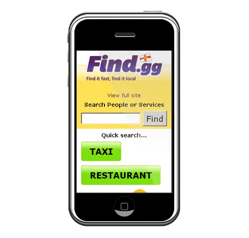
After having implemented the Cable & Wireless Guernsey telephone directory into the find website it seemed a really good idea to try to make this work for people’s mobile phones. The basic interface allows users to search the directory but also includes buttons to frequently searched items. The results were limited due to the way they are presented to us but I managed to ensure phone numbers were clickable on most phones – and allow immediate dialing of numbers.

Another important part of this project was detecting the user was on a phone when they arrived on the site. This was done using an open source rails plugin I have written for accessing the Handset Detection [Link nolonger availible] service. You can find the code for this [plugin hosted at github][2]. Although this works really well to reduce the load on the external service I also implemented some simpler checks for known user agent strings to speed things up a little.

Mobile Website Search for Guernsey Phonebook

Mobile Phonebook Listings for Guernsey [2]: [Link nolonger availible]

2010think Freelance Design

think Freelance Design Website

This was a really quick HTML website that needed some integration with third-party systems to allow the site owner (a freelance designer I work with occasionally) to be able to make changes to the site and accept feedback. The main site itself was all put together using HTML and CSS and after sharing the FTP details and marking up some of the content with special classes it was editable through a brilliant little CMS called CushyCMS.

For the forms I decided to integrate with EmailMeForm, rather than hand coding them in PHP as it just seemed simpler – and reduced the hosting overhead for the client as well.

Basically a really nice website design, quickly built with the minimum of fuss. Job done.

thinkwallpaper

think-design-homepage

think-design-about

think-design-print-quote

think-design-contact

2010

Guernsey Telephone Directory for Find.gg

Guernsey Telephone Directory

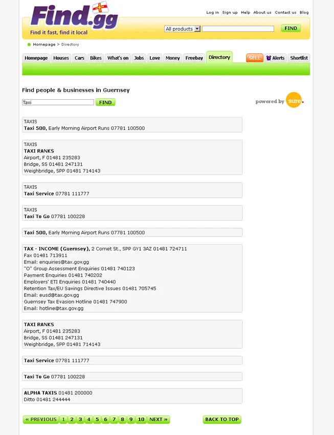
A brief meeting with Cable & Wireless Guernsey and we hit upon the idea of integrating a portion of the find website with their island wide telephone directory. The main complaint with their service was that you had to select several drop down boxes and enter your search into a different box depending on whether you wanted to search white/yellow pages. They have since updated and improved their website but we still prefer our find version. We lump both searches into one and just require a search term from the user. The results are not quite what we wanted but we were very limited by the way the results are returned as pretty unusual little HTML snippets. Too much display information and no semantics were included in the returned HTML, so there was little we could do except output and style what we had. Maybe the next step is for us to build our own phonebook, or maybe business directory.

Anyway, if you need a phone number try the Guernsey phonebook on find.gg.

2010Le Petit Bistro

Le Petit Bistro Website

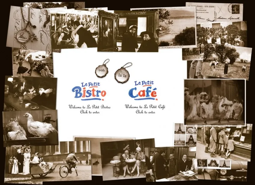
This project was to provide a simple to use wordpress site that conveyed the ambiance of Le Petit Bistro Guernsey to both customers and potential staff. The site was put together using several custom wordpress templates that included plenty of embedded video, graphics and even an mp3 sound track. The site was received well and we subsequently added a companion site for Le Petit Cafe.

You can see the website [Link nolonger availible].

petit_bistro_splash

petit_bistro_menu

petit_bistro_history

2010

Loans Aggregator for Guernsey

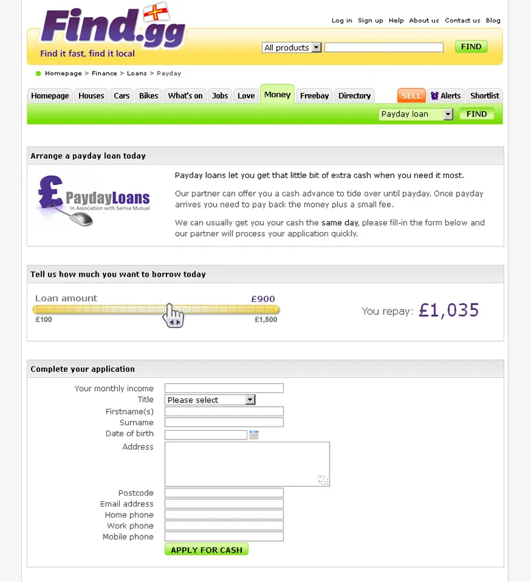
For this project we added the Prototype and Scriptaculous javascript libraries to find.gg in order to provide some sliders and AJAX functionality for a loans aggregator for the local Guernsey loans market.

The loan providers can all be configured in the sites admin interface and the customer simply selects their loan amount and term and their loan options are presented in a grid with details fo the company and their offer. Once the applicant selects more information about a deal they are asked for contact information that we then transfer to the loan provider.

We are really pleased with the way this portion of the site works and traffic seems to indicate people really appreciate this new facility.

payday_loans

loans_aggregator

2010

Logo Designs for AlienEmpires

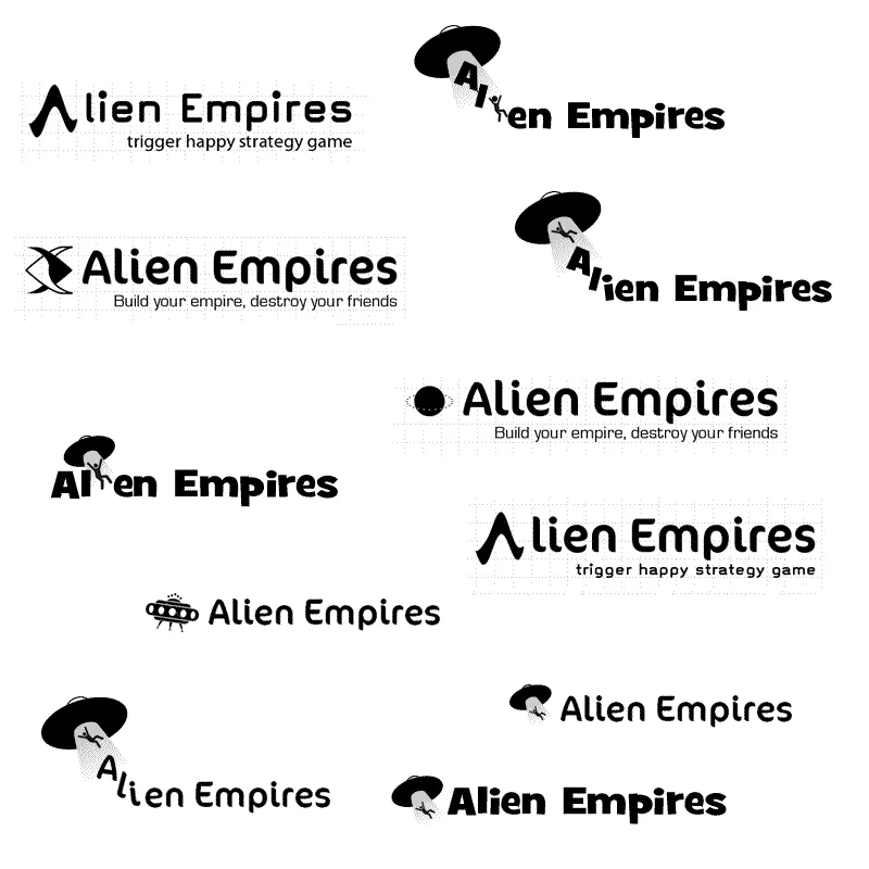
The game may have been around for a whille as lcog but now we have a new name – AlienEmpires, we really needed a new logo.

So here are a few initial ideas…

And a first try with a colour palette. Palette is from dynamicgraphics.com and hopefully matches the kind of colours used in 60s sci-fi.

2010Martel Maides Guernsey Estate Agent

Martel Maides Guernsey Estate Agent Website

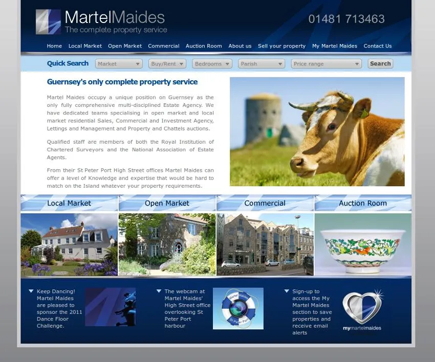
Building Martel Maides a new website was a fairly large undertaking and involved a website build, plenty of custom functionality as well as a complex integration project with their existing back-end system. The website look and feel was provided by a third-party designer and my task was to build the entire site from the ground up including some elements of design, but mostly a large amount of HTML and back-end code which in this case was Ruby.

We decided, in agreement with the client, that Ruby on Rails was really suitable for this project due to the complex nature of the site and the speed at which we could develop a rails site. I think this was a really good decision and the client has had a really good response from their customers. Take a look at the screenshots below, or just visit the Martel Maides website [Link nolonger availible]. After the gallery I discuss some of the key features of the site in more detail.

martel-maides-homepage

martel-maides-local-market-search

martel-maides-property-listings

martel-maides-single-property

martel-maides-photo-lightbox

martel-maides-floorplan-lightbox

martel-maides-commercial-property

martel-maides-content-managed-page

martel-maides-auctionroom-panorama

martel-maides-contact-form

martel-maides-sign-up

martel-maides-email-alerts

Content Management

The site required several important areas of content management. Most importantly were the properties themselves, even though they were going to be integrated with a third party system, as the client needed additional information and photos to be stored for each property; not to mention the commercial properties that were to be handled entirely by the website. Then there was the news section of the site that needed to be as simple as possible for the clients staff to use and allow them to add formatted text and photos to articles. The final areas were the little snippets of content such the copy and rolling images on the homepage. All of these areas were handled within the sites administration system and built using pretty standard Ruby on Rails conventions, utilising the CKEditor where appropriate.

Blog

While the content management allowed the client to add dated news articles and features to the site, some extra work was needed to show these articles off. Each page is listed by category and in a monthly archive in a standard blog format, as well as articles being linked to from other articles that are deemed to be related by the system. I also ensured that newsletters were automatically added to the blog section to minimise the effort required to keep this section up to date.

How house-buyers find the properties they are after is of utmost importance to any estate agent and so extra care was taken with designing the core navigation and search features of the site. Because of the housing control legislation in Guernsey the properties are split into open and local markets. All of the search and navigation on the site is initially divided in the same way and then optionally by sale or rental, then allowing users to select properties by price, parish and bedrooms using a very simple search. These search criteria can either be entered in one step from the homepage, or by drilling down through the menus providing selection criteria by navigation rather than searching. There are also areas for featured and “new to market” properties along the way so that the client could have some extra control over the exposure certain properties received.

Property Listings

Property listings are of vital importance, in almost the same way the text of a google adwords advert are. This is where the user makes a quick decision about clicking further based on the information you provide them. We therefore tried to feature a reasonably large photo of each property along with a short description and other important information such as price, location and the number of bedrooms.

Two of the key features of the property list screens were the highlighting of recently sold, sole agent and under offer properties; as well as ensuring that as many of the elements of the listing clicked through to the detailed version as possible. It is a massive mistake to assume users will always click the “more information” link you carefully place for them and titles, text and especially images should all be made clickable to make it easier for the user.

Once the user selects a property and clicks through the layout changes to allow for a longer description, larger photo and a decent number of thumbnails. I firmly believe the more detail you can give a potential buyer the better. At this point we also introduced the ability for users to share the property on Facebook.

SEO Friendly URLs

One of the really fantastic things about Rails is that it makes it simple to use search engine friendly URLs for your pages. Specifically here we were able to re-use all of the property listing and search pages across local market sales, rentals, open market and commercial. All of these sections benefit from having simple folder names that match the topic that the page is displaying. More traditional ways of doing this may not be visible to google and other search engines – which can really hurt the sites rankings. This was also done within the CMS and blog pages, to enable dynamic naming of pages, categories and folders – allowing the site to grow without sacrificing its structure (in the eyes of google at least).

Automated Email Alerts

A really important factor in winning estate agents business is ensuring it is their clients are receiving new properties from them first. To help automate this property we built a function into the site where users could sign-up and save searches for properties. Whenever a new property is added to the site it is emailed out to everyone who is looking for that type of property. This function works really well and takes advantage of ar_mailer to send emails out in batches and prevent the system from becoming overloaded.

Save Favourite Properties

Another simple piece of functionality that we added for signed-in users was the ability to add properties to a favourites list and return to them at a later date. this was added to make it as simple as possible for users to find properties they had seen before but also to try and encourage repeat visits.

Integration with 3rd Party Estate Agency System

One of the largest phases of the project was to integrate the website with Martel Maides existing property management system, in this case Encore. The system we built synchronised the properties on the website, along with a huge number of photographs, every 30 minutes using Rake tasks that formed part of the Rails application, as well as several windows scripts and rsync running on the Encore server to transfer the data first to a staging area on the web server and then into the database.

Newsletter

As part of the site we built a newsletter builder, based on the same editing capabilities as the CMS, and dispatch system. This again user ar_mailer to send large volumes of emails out to the companies mailing list.

Webcam

As a small later addition, we added a webcam to the site that takes its feed from a computer running in the Martel Maides offices – a pretty fantastic view of St Peter Port harbour [Link nolonger availible].

2010Nerdexpress

Nerdexpress Business Cards

As a follow on from building the Nerdexpress website I was also asked to produce business cards. I think they turned out quite well, although it is a shame that working remotely I never got to actually handle the finished product!

nerdexpress-business-card-front

nerdexpress-business-card-back

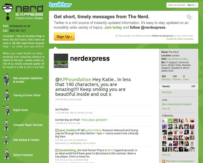
2010Nerdexpress

Nerdexpress Twitter Background

Nerdexpress Twitter Background

As the Nerdexpress company started to work more and more with twitter, Facebook and other social media they felt they should try to push their brand out onto these platforms as much as possible. I was able to help them by producing a background for twitter that was in keeping with the company’s branding and pushed the most important information about the company such as web address and contact details.

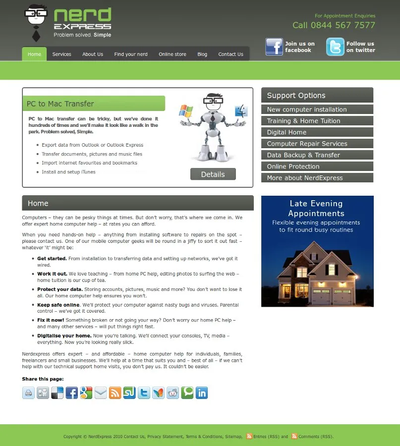
2010Nerdexpress

Nerdexpress WordPress Website

For this job I inherited some branding and an initial homepage design but once I started talking with the client it became clear that the design was somewhat lacking for his needs. I opted for a set of tabs at the top to enter the main areas of the site, including the blog and a secondary navigation menu on the right column of the page. The secondary navigation provided access to the services the company offer. Further to this there is a main banner on the homepage that fades through a set of key featured services to allow the company to make certain offerings even more prominent.

I also ensured that links to the companies Facebook and twitter accounts were highly prominent as this was something they were keen to take advantage of.

The site is put together in WordPress and while containing a blog, it mainly promotes the company’s list of services – grouped into a number of areas that can be accessed through a sliding accordion menu, on the right of the page. All of the information populating the homepage banner (that fades through several services) and the service summaries and menus are driven dynamically from content added to the specific service pages. This makes changing, or adding services very simple – as the site will automatically change to reflect the changes.

Take a look at the NerdExpress website, or you can browse the screenshots below.

nerdexpress-homepage

nerdexpress-all-services

nerdexpress-service-page

nerdexpress-contact

About Nerdexpress

Nerdexpress opened for business in July 2007, due to the growing demand for home computer support – where a technician (i.e. nerd) comes to your house and provides you with any computer support you need.

Support might include setting up your new PC, installing new software, removing viruses, retrieving lost data or even creating the ultimate home theatre experience.

2010Quantum Med Marine

Quantum Med Marine Website

This website build was a WordPress site built to a design put together by our in-house designer and included JavaScript fading images and pop-up windows for video, for which we used flowplayer. The site design had a few complicated elements, mainly the JavaScript fading images that needed to fade in-sync with each other (the ship masts overlap on some images etc.). We achieved a really professional looking site and everyone involved was pleased with the results [Link nolonger availible].

quantummedmarine

quantum-homepage

quantum-video

quantum-video-popup

quantum-contactform

About Quantum Med Marine

For 15 years Quantum has set the global standard for innovative yacht technology. In 1999, Quantum invented and implemented the first successful dual-purpose roll stabilization system, trademarked as ZeroSpeed™. This feat of engineering forever changed the yachting world by stabilizing the rolling motion of almost any vessel not only when underway, but also when anchored or drifting.

2010–2014Sarnia Mutual (later The Loan Shop)Design and development

Sarnia Mutual / The Loan Shop Website

The Sarnia Mutual homepage: "Get the cash you need in just one hour", a list of reasons to apply, a photo of a hand holding banknotes, and a loan application form down the right-hand side

Sarnia Mutual — later rebranded The Loan Shop — needed people who’d already decided they wanted a short-term loan to get through an application in one sitting, from the shopfront on Market Street or from home. The homepage led with the pitch and the clock (“cash in just one hour”) and put the application form beside it rather than behind a link, so starting it cost nothing.

The same PHP and Smarty codebase served both brands as the business was renamed, and its enquiry table fed directly into Appstrack, the internal system built to take that enquiry the rest of the way through underwriting to a signed loan.

2010

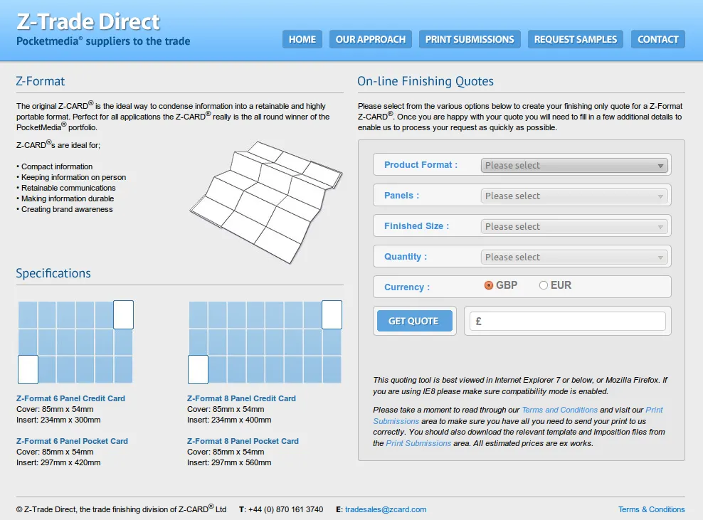
Z-Trade Direct Pricing Matrix Component

For this small project I built a mysql database and PHP and AJAX front-end that enabled clients to get quotes directly from the website. The AJAX allowed you to select various dropdowns, with the following dropdowns being loaded dynamically and finally a quote is produced. The customer can then be taken to a simple contact form that writes contact information to the database, along with the clients quote and emails the details to a member of staff at Z-Trade Direct.

The component I built was designed to be loaded into an iframe within the current website, so I also dealt with styling the forms to match the site that was hosting it.

You can take a look at it in action [Link nolonger availible], or see the screenshots below.

zcardmatrix

zcardmatrix_contact

2009

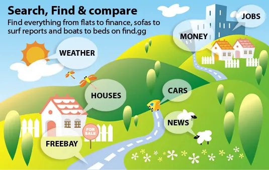
Find.gg A Comparison Website for Guernsey

Find was a joint venture between myself and two collegues that intends to satisfy a niche in the Guernsey market. Many websites exist throughout the UK that offer used cars, estate agents and property etc. but with Guernsey having difficult import/export issues as well as being isoldated from the point of view of commuting – a customer from Guernsey has very little use of UK wide searches.

I was responsilbe for the core design of the site functionality as well as all of the development and some design. The site is implemented using Ruby on Rails and allows for individual customers, as well as companies to list a wide range of items on the site for a small fee. We attempted to create a vibrant and easy to use brand that included some leading edge functionality – such as alerting you by email as soon as items are added that match your searches.

Other innovative features include saving items to your shortlist, which can contain items from any category – as well as automatic posting to twitter, ability to share/like on facebook – see multiple images for a listing and download PDFs.

From a sellers point of view, they are capable of listing their own items and paying for the listings through paypal – without the need of dealing directly with the site owners. For business users we ensured that payment could be done by invoice and plan at a later stage to be able to integrate the site with existing data sources – thus enabling business users to be completely hands-off with the site admin.

As well as including the core functionality for listing, maintaining, searching and finding items the site includes a complete blog that follows the convention of categories, dated archives and tags. A few extra items were included, to try to encourage visitors – such as Guernsey weather forecasts, surf reports and an aggregation of various Guernsey and Channel Island news sources.

In the initial period after release we have seen steadily gowing traffic and have high hopes that find will become Guernsey’s premier website for Guernsey Property, Used Cars, Finance and more.

Find “Splash” Menu

Homepage

Property from Guernsey Estate Agents

Cars From Guernsey Dealerships

List your own cars, houses, etc…

Guernsey Weather Forecast

2009

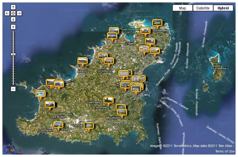
Google maps Mashup for Property in Guernsey

This project was undertaken to add a new dimension to searching for and finding property in Guernsey. Sellers or estate agents are now able to position a marker on a google map to indicate the location of the property and buyers are able to see this location on a map when viewing the property details. This involved plenty of javascript integration between the find.gg website, it’s Ruby on Rails backend and the google maps API.

Once this addition was made we saw an oppourtunity to display property search results on maps (zooming the map down to parish view if possible) or even displaying every property for sale in Guernsey on one google map mashup.

Take a look at the property map here, or see the screenshots below.

property_map

property_location

2009Independent Risk Reporting

Independent Risk Reporting Website

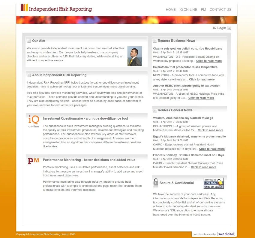
Independent Risk Reporting was a two-part project, firstly to create a simple informational homepage and contact for the client and secondly to create a risk reporting questionnaire system, this brief port covers the brochure website that was created with PHP and the Smarty framework.

The site needed a clean and professional design and the homepage was relatively information heavy, including RSS news feeds from Reuters. The contact information page was seen as a key to the success of the site and time was spent making sure information was clearly presented, the contact form worked well and a google map was included.

See the screenshots below, or take a look at the live website.

independent-risk-reporting-homepage

independent-risk-reporting-contact-us

2009

iQ Investment Questionnare Risk Reporting System

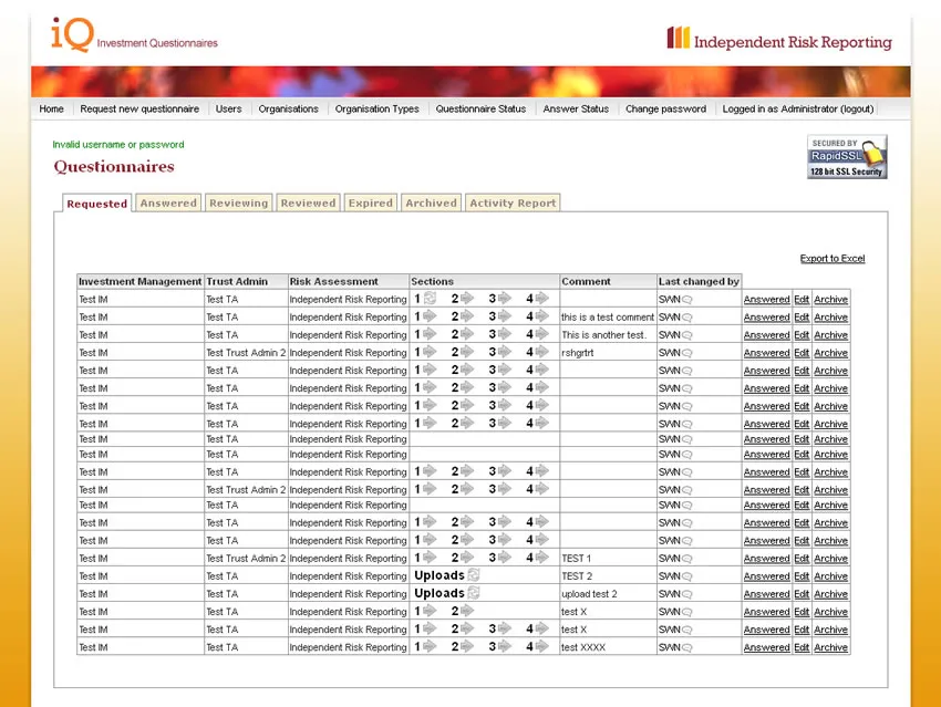
This project was to build an online system with various user roles for requesting, completing and reviewing risk reporting questionnaires. Ruby on Rails seemed the best framework to use for this and a lot of the system simply uses styled versions of the standard Rails scaffolds.

The core functionality of the system was to track the workflow of risk questionnaires and these are presented in a series of tabs, each tab containing a table of questionnaires in that “state”. The questions were then asked in sections, all of which could be dynamically put together with specific questions.

Each section contains a list of questions, with the answer being given as “skipped”, a freeform text answer or a file uploaded. These questions were all answered, changed and saved using AJAX to enable a fast and simple experience for the users.

Once the sections of the questionnaire are completed the answers can be reviewed and a further section is put together to score them. The scoring section uses the same format with AJAX questions and includes HTML templates for the answers that are easily edited within the text editor box.

The key to all of this was security and ensuring various parties were only able to access their own information, and that parties could only edit questions from the correct state in the workflow.

investment-questionnaires-requested

investment-questionnaires-questions

investment-questionnaires-question-skipped

investment-questionnaires-question-answer

investment-questionnaires-question-answered

investment-questionnaires-question-upload

investment-questionnaires-question-uploaded

investment-questionnaires-question-answer-progress

investment-questionnaires-question-scored

investment-questionnaires-question-enter-score

investment-questionnaires-question-review-scores

investment-questionnaires-question-activity-report

2009Z-Card

Z-Card Mobile Website

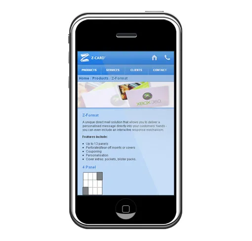
I recently built a version of the Z-Card website designed for people arriving to the site on a mobile phone or other small screen interface. The basic look and feel was handed over to me by their internal creative team and I built it all using Smarty PHP framework. There was also a small and efficient bit of PHP to detect when a phone was connecting to the main site and to redirect them to this version instead. I also did a few extra little bits to make sure the site sized well on iphones and phone numbers and buttons were nicely clickable on touch screens. I will leave you with a few screenshots — the mobile site [Link nolonger availible].

zcard

contact

products

2008

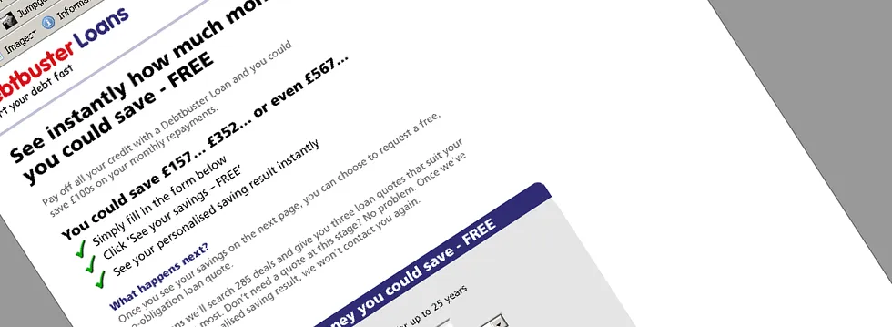
Debtbuster Loans Optimized PPC Landing Page

This design hopes to split the sales messages off onto a front page and then concentrate more on support and reassurance messages on subsequent pages. This design went live in Feb 2008 and so far has had mixed results. Click through rates once customers arrive on the app form are very good but the extra drop-off because of the “pre” page seems to be limiting it to similar performance to the current control design.

debtbusterloans-landing-page-optimization-front-page

debtbusterloans-landing-page-optimization-page-1

debtbusterloans-landing-page-optimization-page-2

debtbusterloans-landing-page-optimization-page-3

debtbusterloans-landing-page-optimization-page-3a

debtbusterloans-landing-page-optimization-page-4

debtbusterloans-landing-page-optimization-page-5

debtbusterloans-landing-page-optimization-page 6

debtbusterloans-landing-page-optimization-page 7 We originally tested this page with a more sophisticated layout but in order to try and improve click through rate I redesigned it with a very simple, linear flow. Although this looks poor, the aim is to more accurately meet the customers thought process and to simplify their eye-flow down the page.

Once the customer reaches the second page they arrive on the application for with our standard questions. This design is much less cluttered than the old designs and simplifies eye-flow by only using a single column.

As usual page 3 is the final mandatory page. After collecting the DPA we can process the customers loan enquiry – subsequent pages help us process it more easily but are not needed.

This design has the same questions as previous application forms (shown here in full) although this page breaks down the normal long page into a series of shorter chunks. This will be measured against the standard one page approach but currently not enough data has been collected.

2008

Debtbuster Loans Optimized Single Page PPC App

This application was the technically most advanced that I built for Central Trust and involved AJAX validation and postcode lookups as well as front-end only Javascript for tooltips and highlight the section you are in.

debtbusterloans-single-page1

debtbusterloans-single-page2

debtbusterloans-single-page3

2008

Development of a logo for briefus.com

It is times like this which I had an expert typographer at hand.

Instead I have to make do with trial and error and the mixed opinion of my friends and colleagues – which is always a rather ugly and unpleasant business. The question is which fonts work best on the following briefus.com logos?

briefus.com is the creative team workflow system I have been working on, it is for small to medium creative teams and agencies – read more about this project on briefus.com [Link nolonger availible].

more_briefus_logo_ideas

briefus_logos

2008

Savings Calculator – Landing Page Optimization

Here I descibe in detail my approach to taking a working control landing page and turning it into something all together more effective. My landing page optimization process, fully at work.

control-page-1

control-page-2

control-page-3

sherpa-test-page-1

test-page-1

test-page-2

The current “control” page

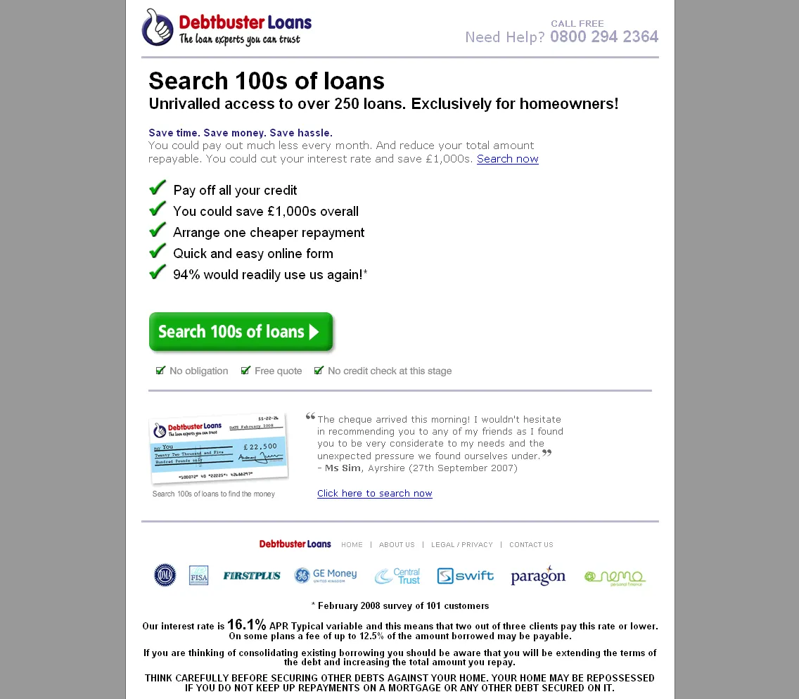
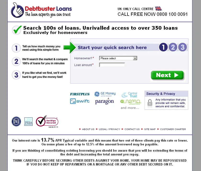
The current landing page has evolved through vigorous AB split testing on PPC. We utilize our highest volume term for this testing, the “Loans” exact match keyword. We have very similar variations of this page for other terms – with the only difference being the header “Search 100s of loans, unrivalled access to 100s of loans, exclusively for homeowners”. This text exactly matches PPC display copy we use on the appropriate terms. We also use this page on a variety of banner and email campaigns – where this header section changes to match the message and graphics of the source media. Everything else on the page remains the same.

This landing page is a three page application form, for the purposes of lead generation. We have tested single page and two page applications but neither beat this control.

Motivation

Our research has shown that approximately 80% of our customers take out a loan for debt consolidation. Our domain name contributes to this, yet we do not currently target our copy specifically at this market. The current thinking is that we can offer loans for any purpose and by targeting consolidation we will lose customers.

We have attempted to address this by tailoring our core value proposition to a consolidation audience. Also by using a page with more copy, we hope to be able to address the concerns and meet the expectations of customers coming from different sources e.g. PPC customers are actively searching for a loan while banner customers were not. The optimized page is designed for use across PPC – “loans” keyword but also more specific “secured loan” and “debt consolidation” group terms.

We will lead new PPC campaigns with a debt consolidation message – similar to the lead message on the new page design.

Our current page requires three pages be completed. Our data is automatically processed and routed to different parts of our business depending on how the form is completed. We cannot currently change the questions we have to ask. We believe that users arriving on the first page are expecting an aggregator style loan search – an expectation which we cannot fulfill. We also believe that requiring a user to stick with a single process over three pages is asking a lot.

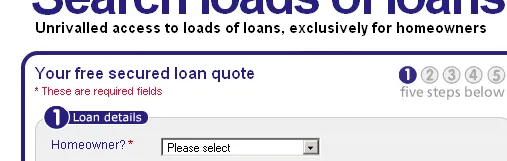
On the optimized page we have drastically changed the “angle” that our app form takes. We have turned the first page into a detailed “savings calculator” targeted specifically at consolidation customers. By asking the certain questions up-front and including “current monthly repayment” and “credit rating” fields we are able to calculate how much money we can save the customer on a monthly basis.

We have also included the email field (optional) at this stage. If they provide their email address then we will email them their saving quote – plus we can send a customer service email if they fail to complete page two. As our processing requires an email address for a full application we will need to ask for the email (mandatory) on page two if the user does not already supply it.

We are trying to turn a process which spans three pages look like two separate processes, each of which are shorter and provide feedback to the customer.

Value Proposition

As our product (secured loans) is a commodity which differs very little from company to company – and especially as we are a broker offering exactly the same loans as other brokers – we have struggled to find a compelling value proposition. Our company has built itself on excellent customer service, highly efficient marketing and processing, which we realize are not unique enough to form a value proposition.

Our current control uses our PPC copy as it”s value proposition “Search 100s of loans” which a number of our competitors also use in one form or another. We do not have the most loans, so we have decided to move away from this message.

We have tried to differentiate between the first and second pages of the application in order to compel customers to disassociate it with a single, long form to fill-in. Our first page leads with the value proposition…

See instantly how much money you could save every – FREE.

This fits the new style app form, which will calculate the customer”s savings and display the result on the second page.

The remaining copy on the page all tries to reinforce this message and explain what the user will get when they complete the form (this page). We have also tried to emphasize the fact that this is a totally none-committal stage in the process.

The second page will calculate the customers saving and display an appropriate message (we will have a generic message if we cannot save them money e.g. the user fills in zero for their current monthly repayments)…

We could save you £XXX every month.

The second page leads with a saving we have calculated from the data the customer has provided. We hope this is a strong message to get them to apply for a further quote – something we try and emphasize in the remaining copy on this page.

Friction

Several major areas of friction were identified on the current page.

Number of questions

Unfortunately this cannot be changed as these questions have been integrated into a rules engine for prioritizing and segregating our leads. Hopefully this has been alleviated on the optimized page by splitting the process into two separate forms – each of which has a clearly identified result for the customer.

Difficulty of questions

Some of the questions have relatively easy to misunderstand answers – such as are you a homeowner: yes, no, yes – but I don”t pay a mortgage. We have set default values where appropriate on the form in the optimized page but we cannot change these questions.

Eye flow

The eye flows from the logo (which is oriented inappropriately as it has been taken from offline designs) and across to the value proposition. This initial step isn”t too bad but the eye then proceeds down to the application form. This is an obvious problem because as yet we have told them virtually nothing about who we are, what we offer and why they should deal with us. The optimized page simplifies the layout significantly with just a single column.

We have also adopted a much less cold approach to communicating our messages and have added lines to the application form to help explain and reassure the customer.

Three page process

The first page serves no purpose other than to collect data – and it there is no logical text to place on the button because of this. When the user sees “Next” they must be thinking “how many more pages”. We had previously tried to solve this by placing all of the questions on a single page – but we believe this made matters worse because the form became daunting and intimidating.

For the optimized page we have broken the process down into two distinct and useful stages for the customer. The first page now has a distinct purpose and a result on page two. Page two then becomes the “application” in the customer”s mind (although really we need data from both pages).

Anxiety

Several major areas of anxiety were identified on the current page.

What am I committing to when I complete this form?

Splitting the process into two distinct phases should help this as the first stage can be totally none committal. We mention this several times in the copy and the way the form is presented should convey to the customer that their result will be displayed on the second page but that this is not an application, or an application for a quote.

Page two of our process is an application for a quote – still none committal but we will contact them. Our current control does not explain this at all and is presented as an “application form”. To me that suggests a certain level of commitment, while a “quote” does not. This stage of the process is simply a quote – so our new page now presents it as such.

Nature of the questions

We ask for a lot of personal information, especially a lot of contact information. We cannot change this but have tried to explain how and why we need the information – justifying it is much as possible.

We have also moved our VeriSign seal from the bottom of the page to adjacent to the form buttons.

Incentive

We have tested various incentives on our direct mail campaigns with varied success. Given the nature of our business we can only offer incentives to people who actually take out a loan with us, and as such it is a decision of some gravity. We have decided not to add an incentive at this stage but it is something we need to pursue in the future.

2007

BriefUs Briefing System

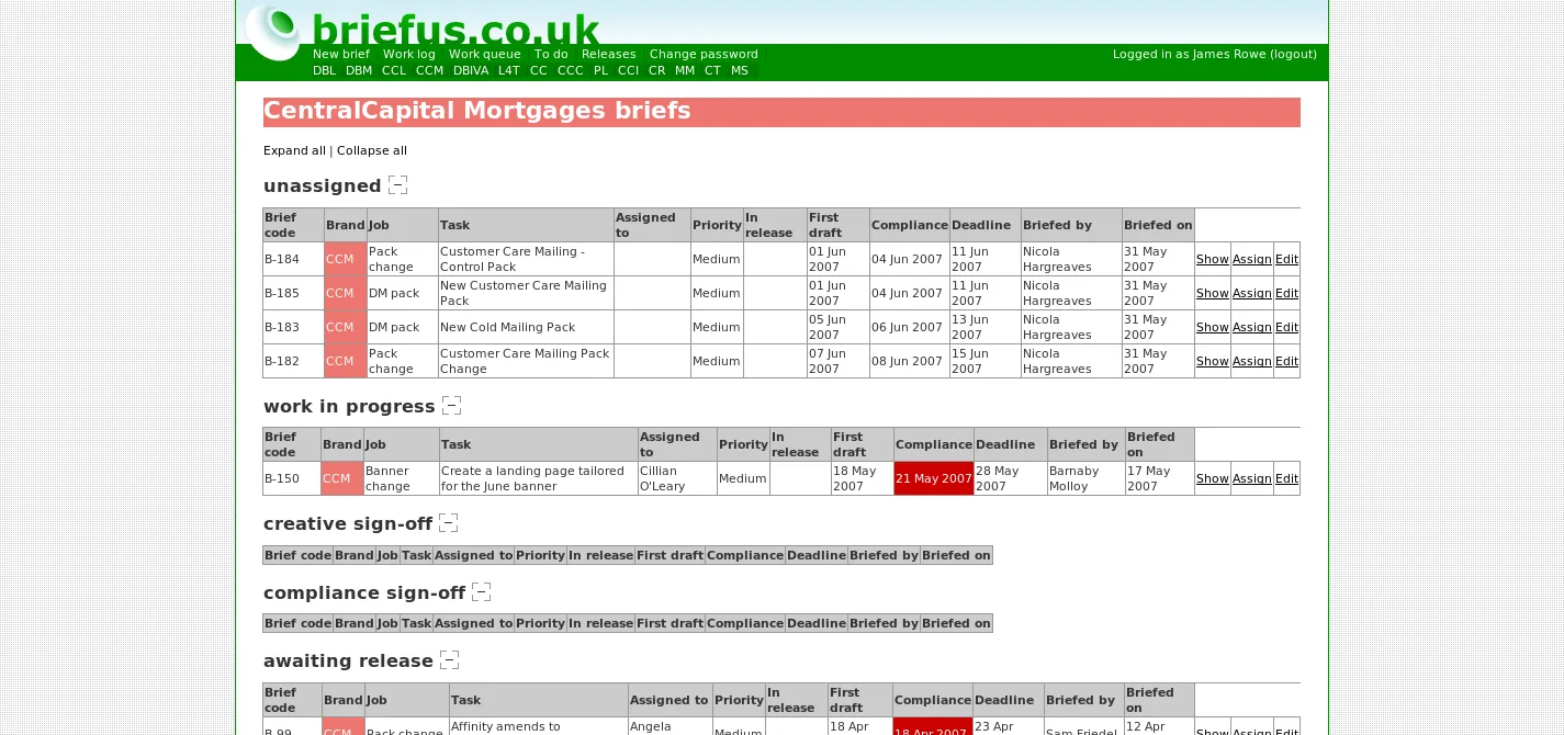
As the companies creative team (web and traditional) grew, we required a system for managing our briefing system. I designed and wrote briefus to meet this need. All members of our marketing department have access to the system and are able to create new briefs. One of the creative team leaders then assigns the brief to a member of the team and sets deadlines. Members of the team manage their work using their personal “to do” list and brand teams manage their briefs through the brand pages. The system has been a complete success and we have saved hours of administration time each week. The site was written using Ruby on Rails and released Mar 2007.

[Link nolonger availible]

briefus-submitbrief

briefus-todo

briefus-worklog

briefus-one-brand

briefus-view-brief

briefus-edit-brief

briefus-pending-releases

briefus-view-release All members of the marketing team (and several users elsewhere in the company) have the ability to access the system and are able to create new briefs. This page collects the core information about the brief, such as deadlines and job details and provides text boxes for the user to provide detailed briefing information.

Each member of the creative team has a personal “to do” list of briefs that have been assigned to them by the create team leader. The list is broken down by the current state of the brief and allows the user to view or edit the brief. Create team members can see each others “to do” lists but other briefus users cannot.

All users have access to the “work log” this lists all briefs (old briefs are archived after 30 days). It allows management to see the state of each brief and monitor the work entering and leaving the creative department.

The “work log” can be filtered by brand in order that a member of a brand team can assess the position of briefs for their brand. Normal users can view any brief but they cannot edit them.

When viewing a brief the information is displayed in a clean and concise format, with limited formatting of the text fields (markdown syntax allowed on the create brief page).

Creative team members are able to edit briefs in order to keep their status up to date, to change details or to add comments. When a brief is modified the person to whom the brief is assigned and the creator of the brief are emailed a copy of the brief with a summary of the changes that were made. This helps to keep everybody on top of what is happening to their briefs.

The web development members of the creative team need to be able to manage a large number of brands and sites and so being able to assign briefs to specific site releases is essential. This page includes a summary of the briefs that are included in the release. Keeping track of briefs and releases this way allows for better testing prior to release and keeps a definitive record of what went live and when.

The view release page displays more complete details of each brief that is assigned to the release.

2007

Central Capital Mortgages

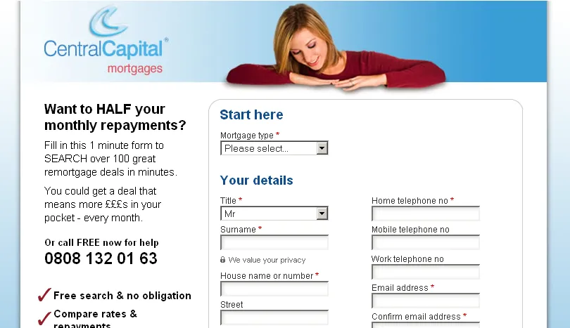
The Central Capital Mortgages site has been running for a number of years with limited profitability. My redesign has made huge improvements and at present other marketing campaigns have been suspended to concentrate on PPC as it has become the most profitable channel for the business. The site went live Jan 2007.

central-capital-mortgages

central-capital-mortgages-application This new design went live 26th Jan 2006 and had an immediate impact, with the conversion rate moving from 3.3% to 7.7% on the remortgage PPC keyword on google. The site featured a single long form rather than several shorter pages, images were used sparingly only to direct the user to the form and it used shorter copy than previous versions of the site. Also the site removed the normal navigation features (such as a home link) which we believe contributed hugely to this improvement.

2007

Debtbuster Loans AJAX PPC Landing Page

In Sept 2007 I designed a new landing page and added a number of enhancements to the application form. Primarily these were client-side enhancements based on usability. The design was never fully utilized but the application form enhancements were retrofitted to the current site.

debtbusterloans-new-landing-page

debtbusterloans-ajax-validation

debtbusterloans-tooltips

debtbusterloans-postcode-search

debtbusterloans-suggestions

debtbusterloans-rest-of-the-app

debtbusterloans-retrofitted-to-control This new design was an attempt to add clearer messaging and more elements to reinforce the users trust in the site/company. This included a single core message at the top (mirroring the PPC copy in use), three simple bullet points on the left, addition of “lender logo’s” and the added prominence of the “security & Privacy” comment.

One of the largest changes to the application form was the addition of AJAX (using prototype) to implement server side validation (the exact code that would run on a form submit) when the user tabs out of the field. This enables us to validate more accurately than javascript alone and we tick the users answers to give a sense of context within the page – and a sense achievement and progress.

Along with AJAX, I also added javascript to stop invalid characters (such as text in amount fields) to stop invalid input before the user even leaves the field. In this case we also added a change in background colour (for a flicker) to acknowledge the users key press.

I implemented tooltip style help for the user, which enabled me to add more text than I had on previous versions of the application form and add some much needed explanation of some of the more complex fields (especially on later pages).

This was one area I felt I could improve the users experience more than any other. By using a 3rd party address search behind the scenes I was able to remove several existing fields and look-up the address (bar the first line) from a postcode. This was implemented using AJAX and server side code.

Once I had searched for the postcode, I also had a list of possible “first lines”. I again used AJAX to filter this list on the users selection and present a suggestion style pop-up to select their house. They are still able to manually enter their address (filtering this list as they type) but the look-up should improve speed and accuracy of entering the address – especially for long house and/or road names.

The next two pages of the application form follow exactly the same style as those already shown.

After testing this application form for a limited time, we saw a 2-5% improvement on click-through-rate on each of the pages, with a 30% improvement on the address page.

Due to company politics the new design was removed, but the benefits of the application form changes were kept, as I subsequently implemented them on the existing control. We continue to see the same improvements on this page, especially on the address search page.

2007Debtbuster Loans

Debtbuster Loans Website

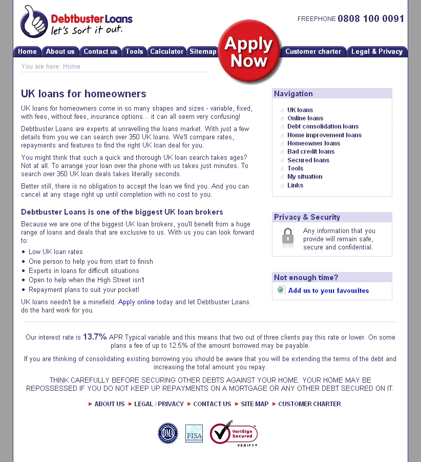
Until this release very little effort had been made to increase the sites visibility in natural search engines. This version of the site was used on all none landing pages and was more text based, it went live Sept 2007.

[Link nolonger availible]

debtbusterloans-homepage

debtbusterloans-calculator

debtbusterloans-seo-debt-consolidation

debtbusterloans-sitemap The homepage is optimised for the UK Loans keyword (loans by itself being extremely competitive) and the design is text-heavy and quite simple to allow spiders to crawl the site as easily as possible. Semantic HTML has been used and is styled using CSS, again to help the spiders.

The site includes a number of interactive features such as the calculator, budget planner, feedback forms and application forms. The calculator takes it’s settings from an XML file and chooses an interest rate based on the loan amount selected and then does the calculations for the user.

The site now includes a hierarchically structured set of authority pages, at the top level we are aiming for the keyword “UK loans”, then at the next level more specific keywords like “debt consolidation loans”, below that level other pages are even more specific versions in an attempt to get the maximum exposure on a variety of phrases within the search engines.

the sites custom CMS also included a glossary system where specified keywords could be automatically picked-out within the site content and linked through to relevant pages, allowing for a much higher level of internal linking and linking within paragraph content rather than just menus.

The sitemap mirrors the hierarchical structure of the authority pages, as well as the other pages in the site.

2006Central Capital Commercial

Central Capital Commercial Website

[][1]

This was a relatively new brand for the company and had been untested on the web. This was entirely my project from a creative perspective and I managed the relationship with the marketing manager and conducted all of the branding, design and web development. The site went live Feb 2006. We ran a PPC campaign for 9 months but eventually it was cancelled as the quality of enquiry was not sufficiently good (too many people applying did not match our commercial loan criteria). The site is still used for traffic from emails and mailing packs.

central-capital-commercial-homepage

central-capital-commercial-application

central-capital-commercial-customer-examples The homepage is designed to try and reinforce the credibility of a new brand and to allow people to navigate to the application form. It suffers like many of the pages in this site of too little content to justify the amount of copy in the left column. This was done to reduce the visibility of the “wealth warning” legals on the left.

The application form was the landing page for a PPC campaign and had to maximise conversion rate. To do this the page layout was modified to put the application form in the prime location, with supporting information on the right. With hindsight not enough time was spent on the actual form elements, although the CTE was reasonably good – the enquiries were of a poor quality.

[1]: http://www.jimcode.org

2006Central Capital

Central Capital Website

This is the Central Capital loans and mortgages site, mainly used for marketing to customers. It links through to the centralcapitalloans.com and centralcapitalmortgages.com sites. It went live Nov 2006.

central-capital-homepage

central-capital-sitemap

central-capital-about-us The homepage is packed with marketing messages with the main emphasis on users selecting either a loan or a mortgage when we direct them to the correct site.

The sitemap lists the limited number of pages on this site but also directs users to the other sites that target particular products.

Each of the pages on the site follow the template shown on the final page. It retains the corporate looking border and gradient, but simply has a two column display – one for content and one for an image.

2006Loans4Tenants

Loans4Tenants Website

I designed the loans4tenants site and created the logo, although there was a colour scheme change before we went live. I build the site myself, including the application form, which includes optional sections and pages – up to a maximum of 10 pages. The application form includes some javascript to hide and show sections and sends it’s data through to a SQL Server database. The site was received very well by the business and enquiries were raised by approximately 50% (no data was collected on the previous site!). The site was also the first to utilise my custom written CMS system called dabble that made use of XML and XSLT from within a custom ASP.NET HTTP handler. The site went live Nov 2006.

[Link nolonger availible]

loans4tenants-homepage

loans4tenants-application1

loans4tenants-page2

loans4tenants-page2a

loans4tenants-redirect every page of the loans4tenants site includes the first page of the application form in a panel on the right hand side. The design is simple and clear, with navigation relegated to the bottom of the screen, emphasising the application form.

Once the user submits the first page of the application form they are transferred to a slightly different design, with the application form taking up the whole page. In this example the user has validation errors from the first page (submitted from the homepage) and must correct the errors before they can proceed to the next page.

The second page of the application has optional sections which are hidden or shown based on the answers the user gives (javascript). This page also includes a previous button – with such a long and complex application form we felt users would benefit from being able to go and review their answers.

This is the same page as show above, but the user has indicated that they have not been in their current address for three years. In this case we need to gather the details of their previous addresses.

Traffic to this site has primarily been forwarded from one of the companies other brands. The other brands cannot offer products to people without a mortgage and they are redirected to custom pages within this site explaining why they have been sent here and trying to reinforce the relationship between the brands in order to build trust.

2006Platinum Loans

Platinum Loans Website

Platinum Loans was a new brand created in order to offer an individually chosen loan plan with a low rate so that we could advertise a low APR. Compliance required that we check the users eligibility for this plan and we had to provide duplicate versions of the site for other APR’s. The design was provided by our creative team and I built the site, application form and the management of different APR versions of the site. The site went live June 2006 followed by a number of changes over the following months. After six months the PPC campaign was withdrawn as we felt the process of applying was too confusing due to the compliance requirements.

platinum-loans-homepage

platinum-loans-application1

platinum-loans-application2 The Platinum brand was created in order to advertise a low APR on the homepage emphasises this. Three versions of this page could be navigated to, each with a different APR and the user would start on the lowest rate and then be redirected to the lower rates if they were judged not to meet the criteria required for this plan. The whole site dynamically displayed the APR’s so that we didn’t have to repeat messages, or layout.

This page asked the user to confirm that they met the criteria for the current loan plan, these questions changed depending on which version (which APR) the site was displaying. The user would then be redirected to either the application form, or to a version with a higher APR.

The actual application form sent it’s data through to the back-end system as XML, adding extra information to indicate which version of the site the user had filled the form in on.

2005Guernsey Electricity

Guernsey Electricity Website

The Guernsey Electricity site combines a professional corporate look with a highly accessible structure. I have tried to emphasise the most used areas of the site (primarily the online services) while still allowing users several ways of navigating to the page they want. The site includes several areas of dynamic content such as the animated javascript news ticker and the product listings in the retail section. This content is provided from a Microsoft SQL Server database using ASP. The site went live March 2005.

http://www.electricity.gg

guernsey-electricity-homepage

guernsey-electricity-readings

guernsey-electricity-payments

guernsey-electricity-statements The homepage uses the standard layout and includes some welcome information and a javascript and css news ticker.

It was becoming increasingly difficult for our meter-readers to gain access to peoples property so we added a facility to the site for people to enter their own electricity meter readings and ensure they are accurately billed. This service was extremely popular and was the largest driver of traffic to the site.

We added a section to the site to allow people to enter their account number and pay their bills online. Credit card payments were taken by a secure third party payment service which was integrated into the site.

Due to the popularity of the other online services we decided to add the facility to view your electricity statements online. This project required a high level of security to ensure people were who they claimed to be (the sign-up process was integrated with back-end systems and passwords were sent by traditional post). We also needed to ensure that other peoples statements were not available to other logged-in users.

As a utility provider we had an ethical responsibility to maximise accessibility. In order to achieve this the entire site was implemented using CSS rather than table based layouts and it’s standards compliance was taken very seriously, although in places compromises were made to ensure a better viewing experience. The site also implements an alternate set of high contrast stylesheets with a simpler layout, larger (scalable) text and fewer images